 This bathroom update was a long time coming! We had some pretty major plans for the two bathrooms on the main floor when we moved in, but they didn’t have to be done right away so we just left them how they were.
One of the bathrooms is a super tiny master bathroom, 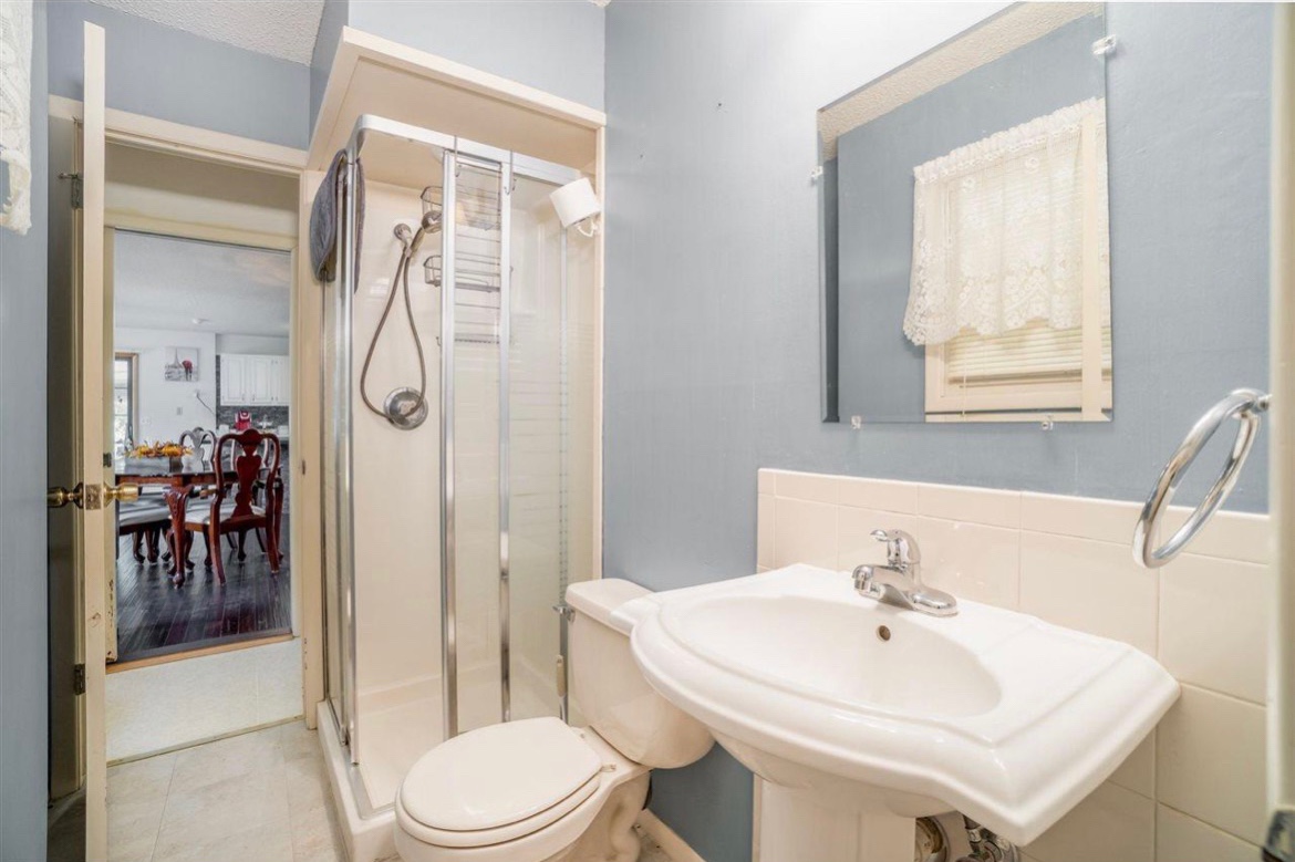
and the other one is a larger guest bathroom. 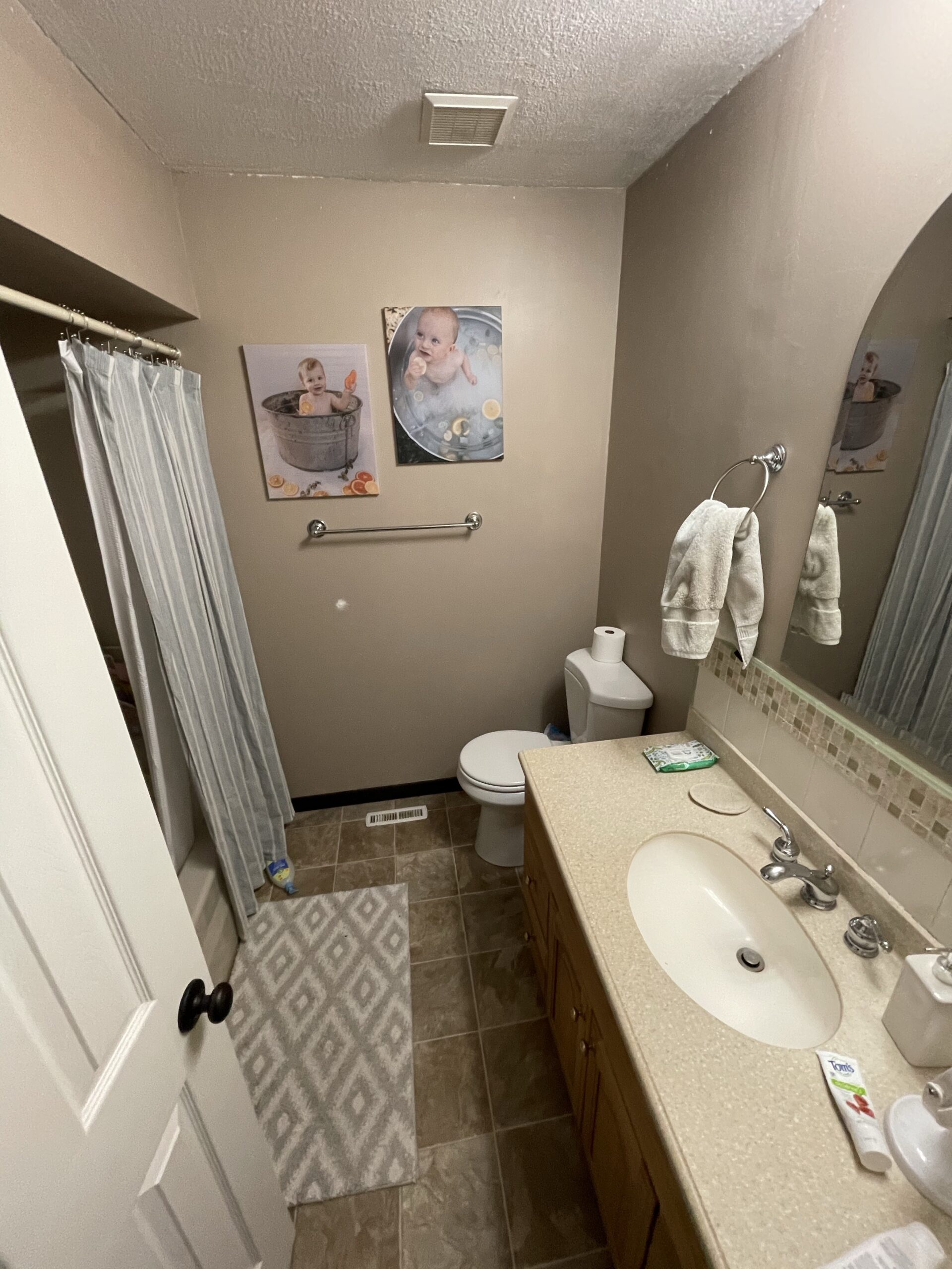
Since these rooms share a wall, our end goal is to make the master bathroom larger by moving the wall over into the guest bathroom.
FLOOR PLAN: BEFORE AND AFTER
This might make more sense to other floor plan nerds like me lol.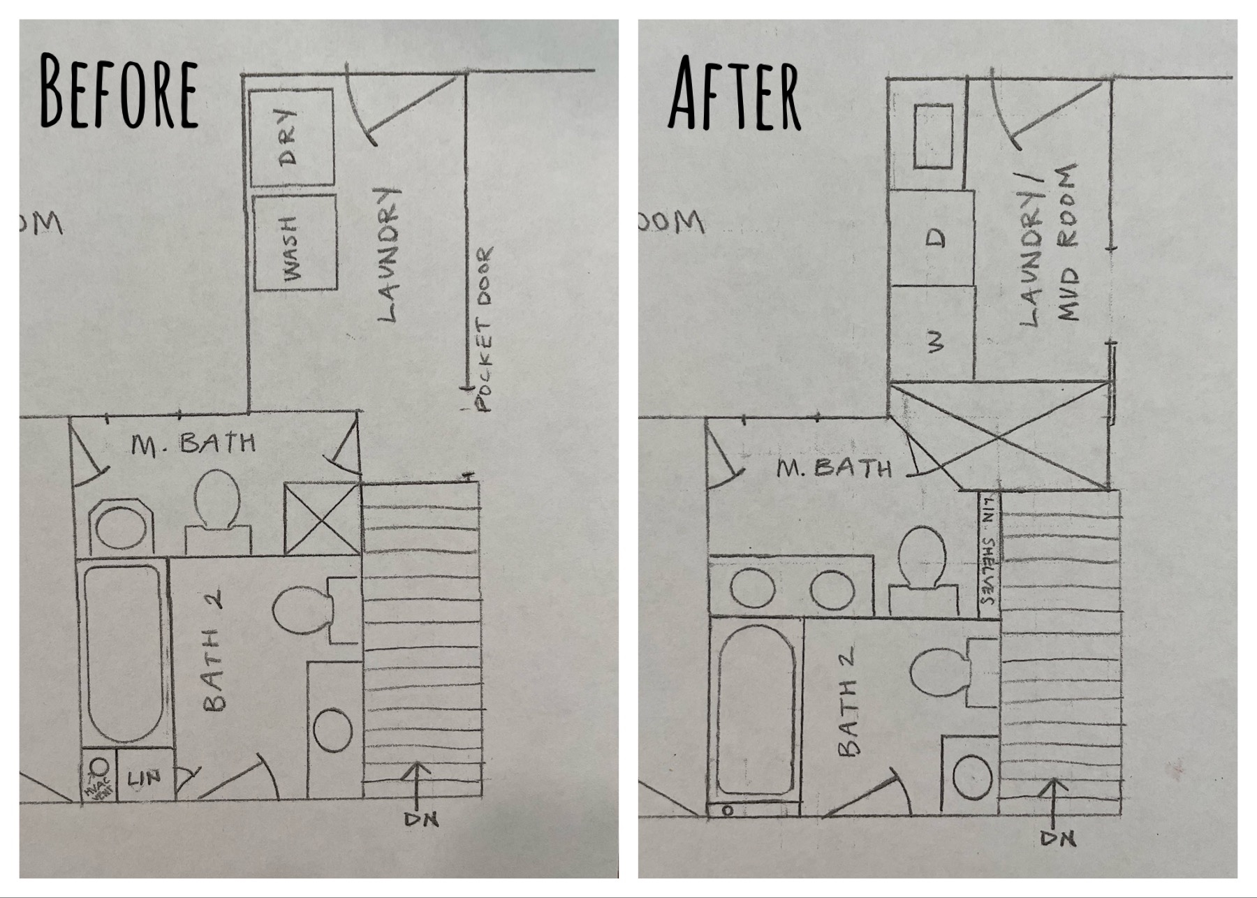
The master bathroom had a door leading through the laundry room and into the kitchen (super weird). We closed off that doorway and moved the laundry room door over, essentially eliminating the weird hallway and making a private master suite with space for a large shower in the future (the final part of the project). 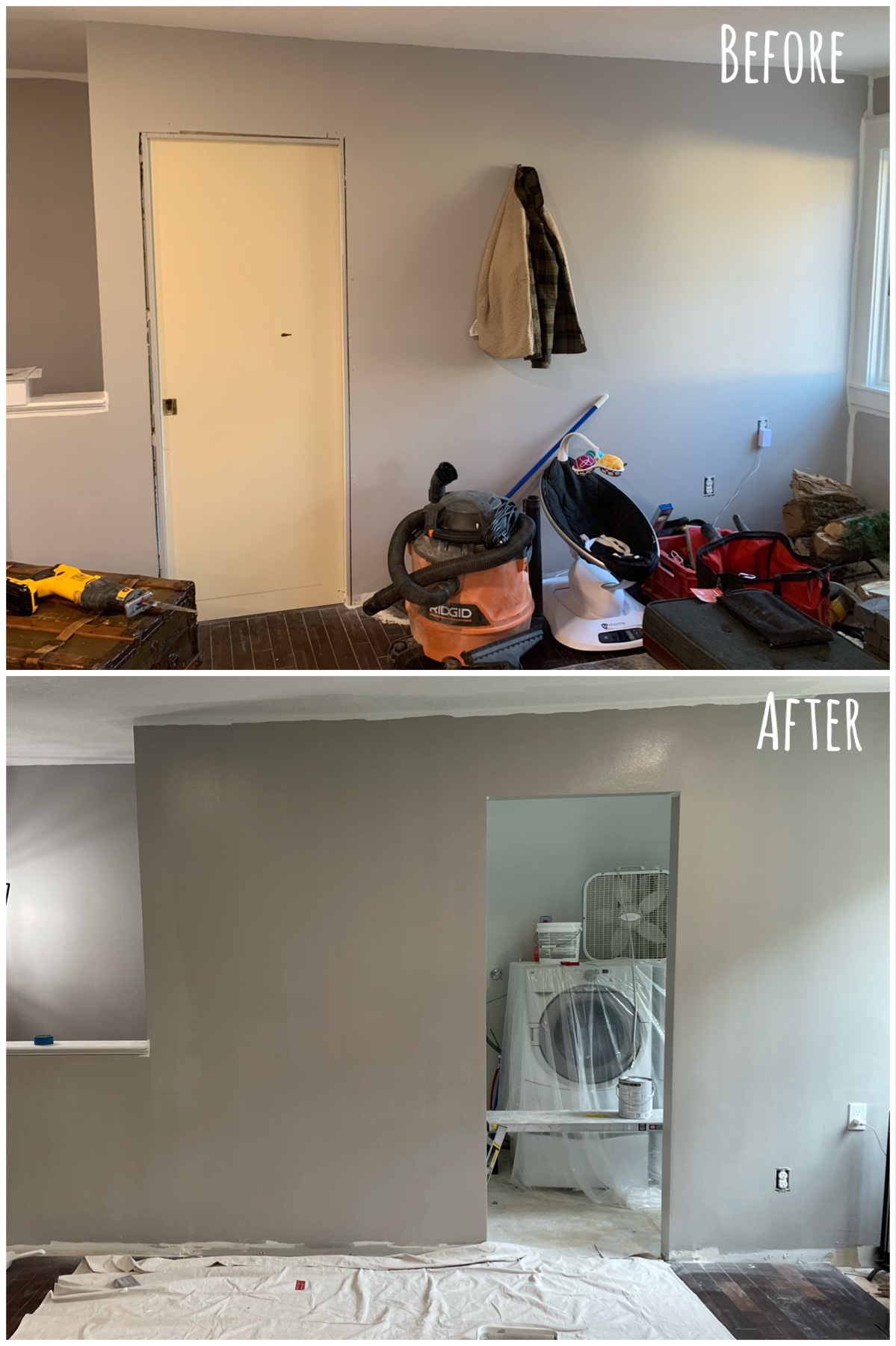
The next step, then, was moving the wall in the guest/kid’s bathroom. In order to move the wall, the bathtub needed to be moved over, and this meant losing a linen cabinet… (We still have a linen cabinet in the hallway, so it wasn’t a huge deal).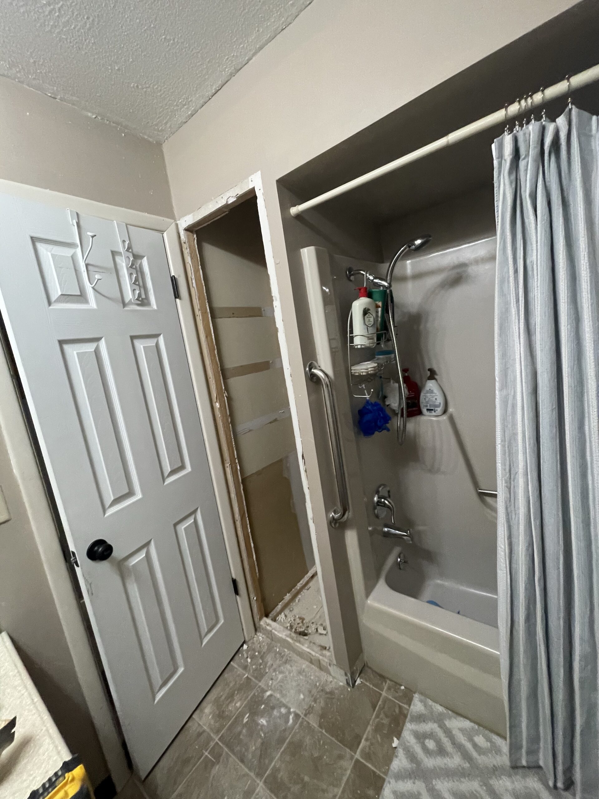
**(Even though we moved the wall in the guest bathroom, we kept the original wall where it was in the master so that we could still use it temporarily).
GUEST BATH DEMO
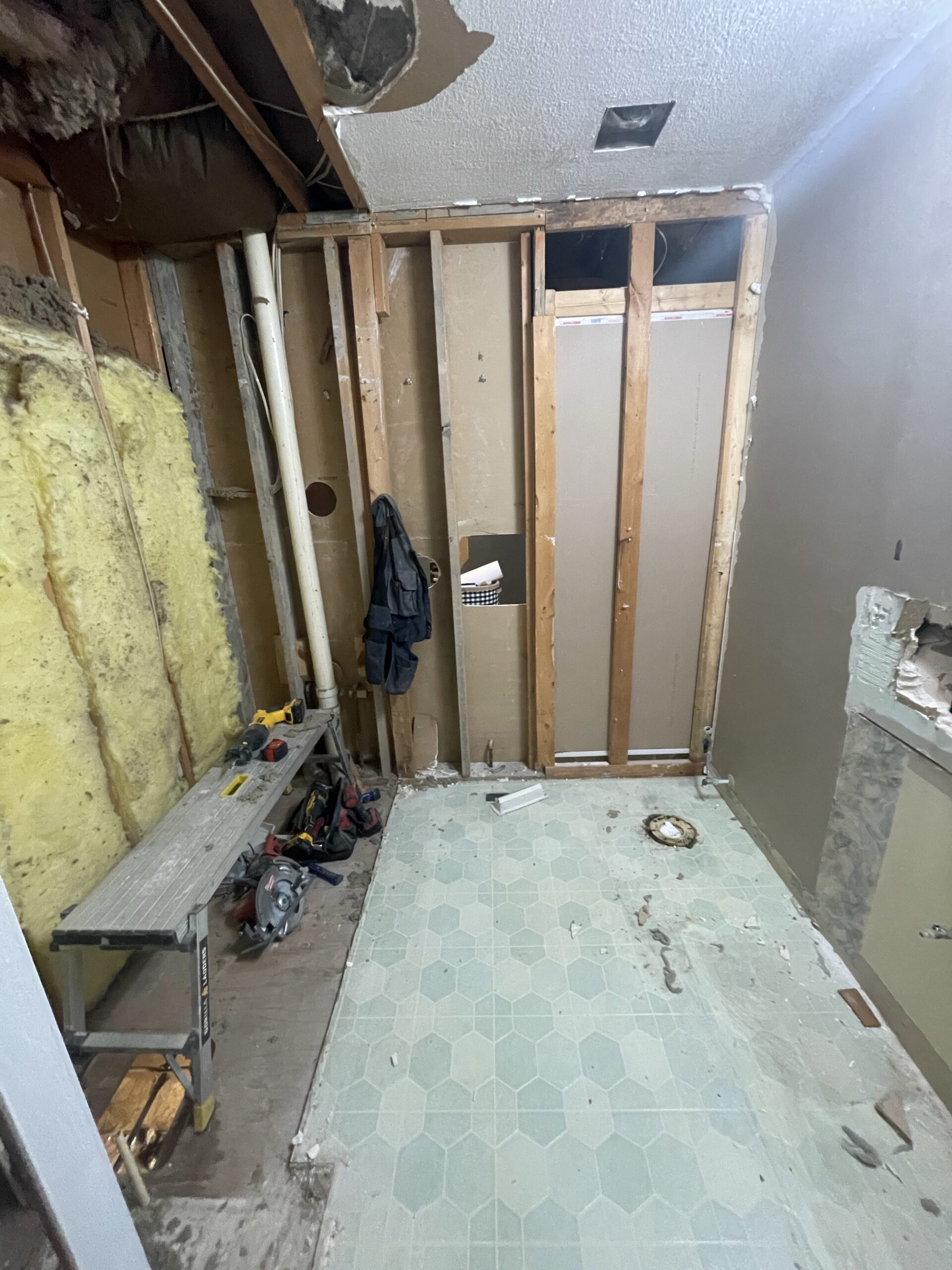
The demo went pretty quick! We took out the linen cabinet first and discovered an HVAC pipe that couldn’t be rerouted… so we decided just to move it over as much as we could and frame around it.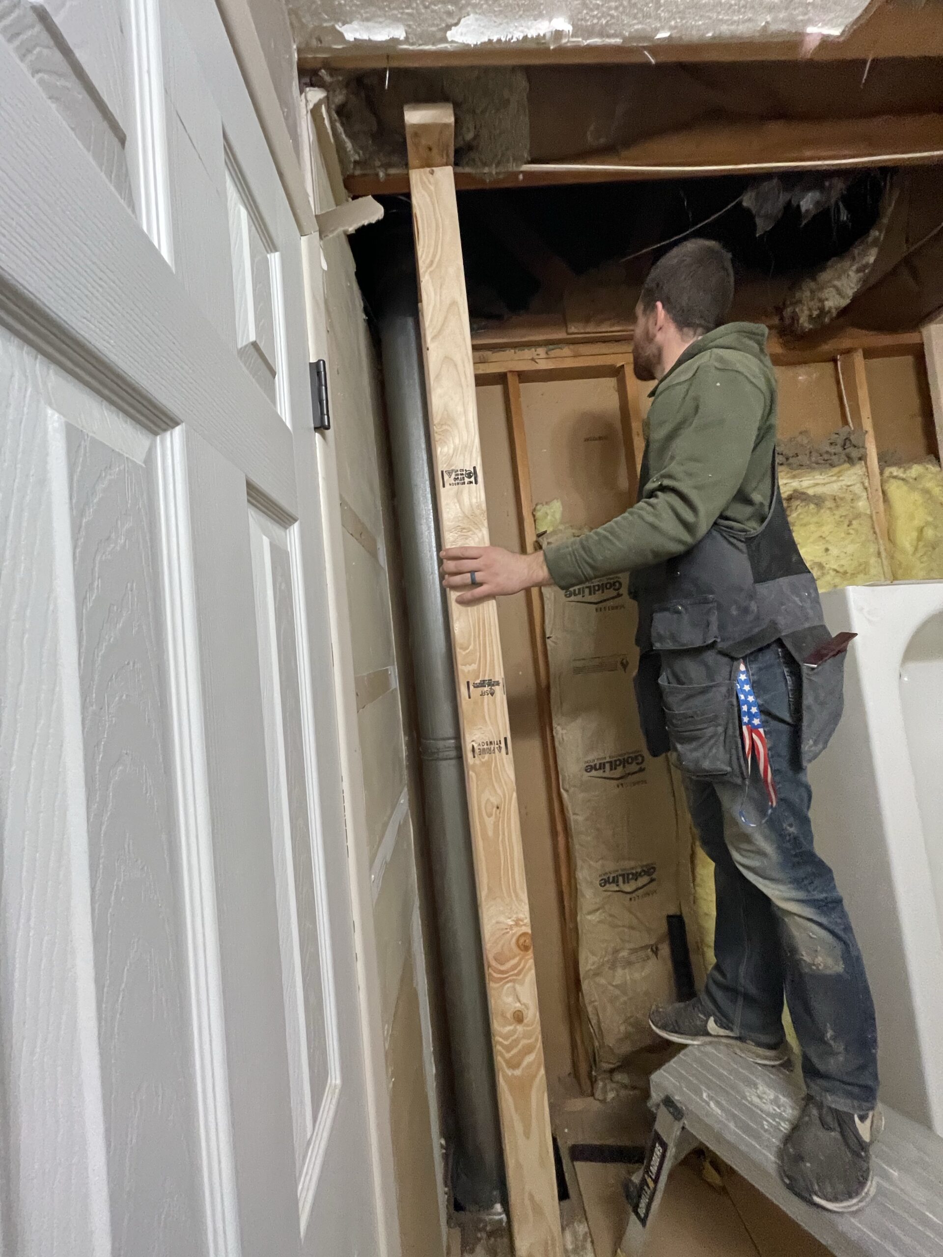
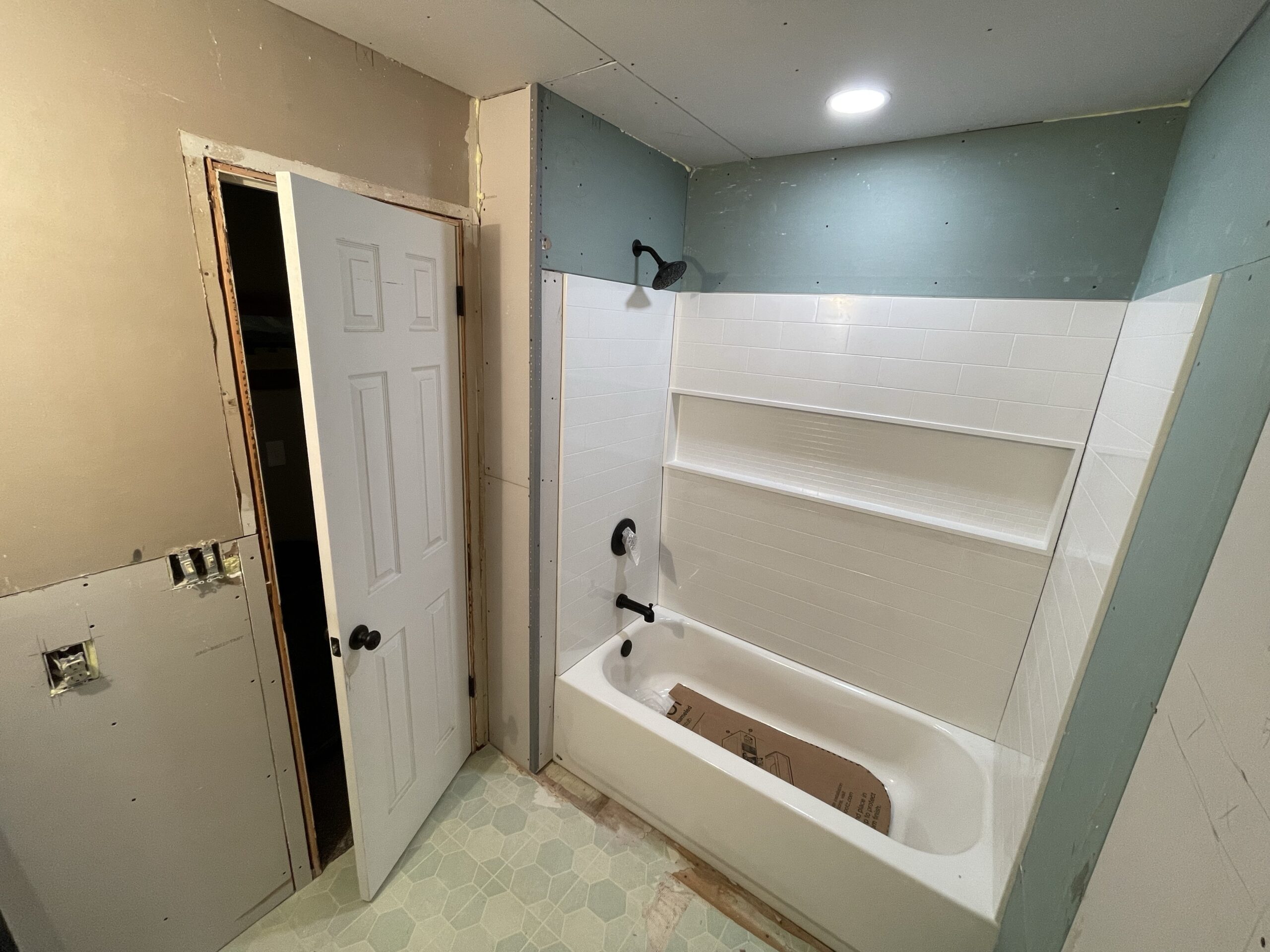
Little challenges like that are always discouraging, especially when the entire design is dependent on maximizing EVERY INCH of a small space. But I’m proud that we will be able to gain more space in the master, even if it’s a little bit less than what we thought. 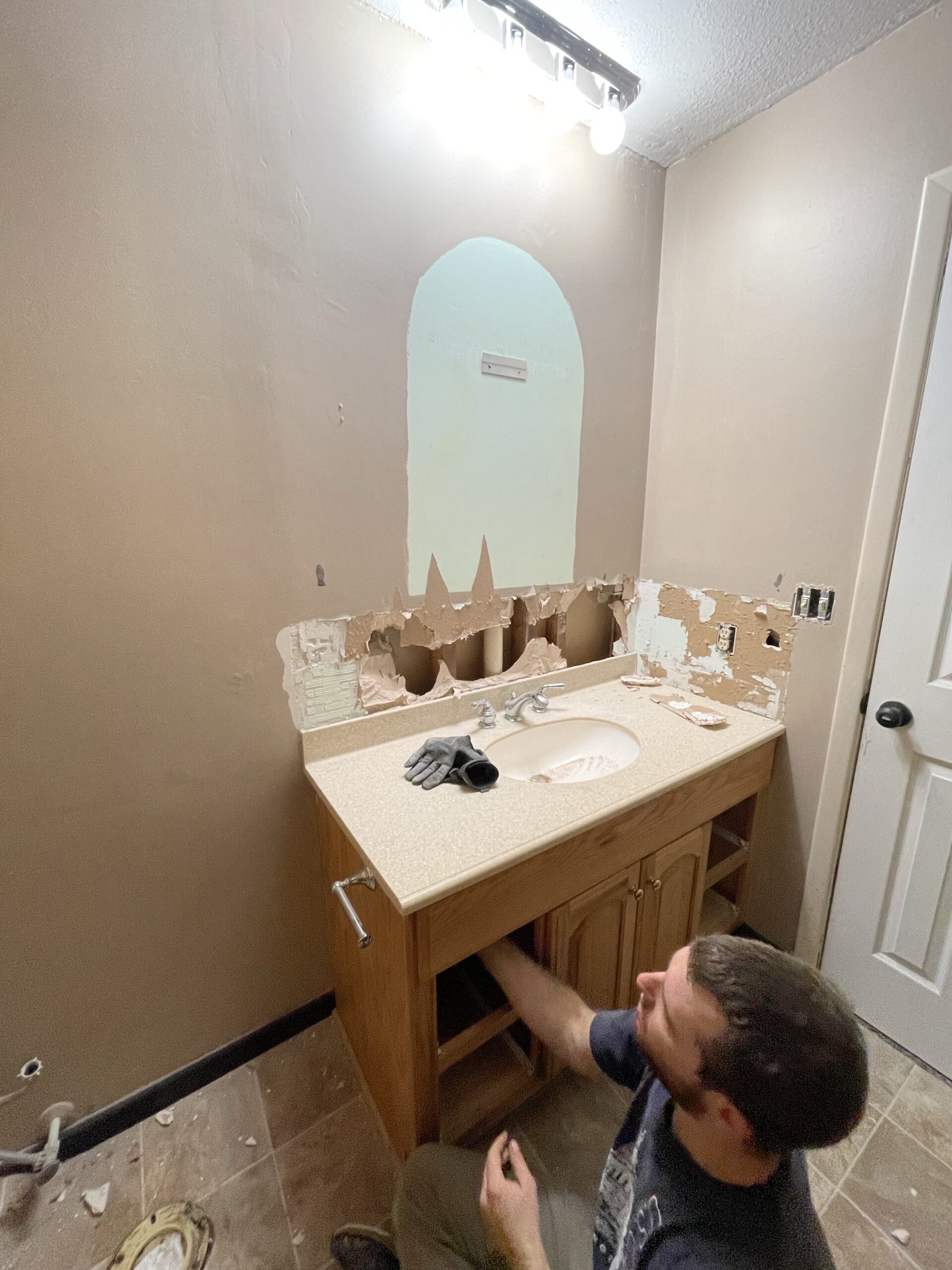
We removed the giant bulkhead above the tub which instantly transformed the space, and the old vanity had to go because we needed a smaller one.
Everything had to be moved over including the bathtub, floor vent, fan, toilet, sink plumbing and even the light above the vanity. We added another light above the shower, replaced the drywall, and installed new subfloor.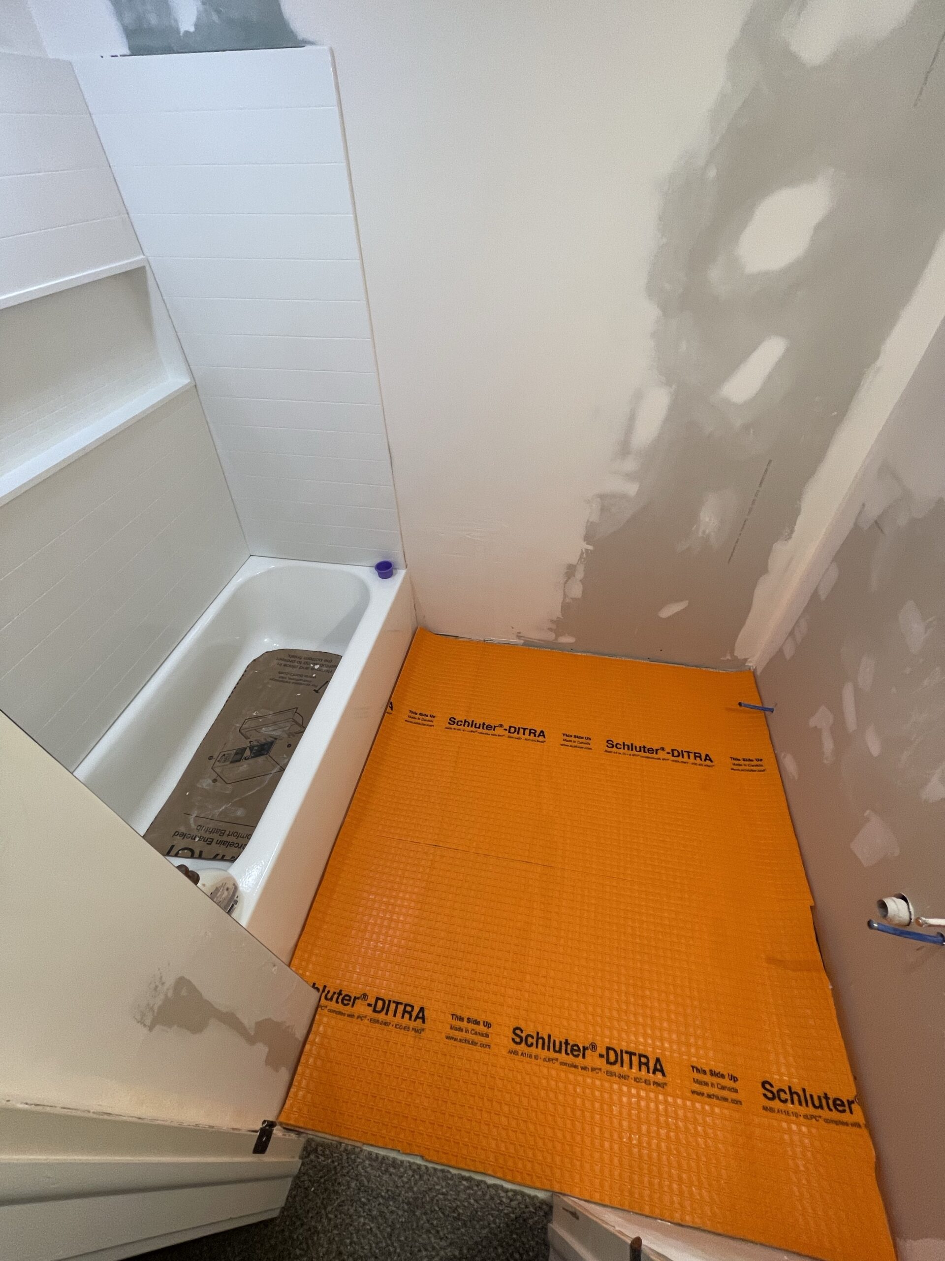
PRODUCTS AND DESIGN
I made a mood board for this bathroom to help me envision everything. Some things are slightly different, but I tried to use pictures of products that we had or planned on using!
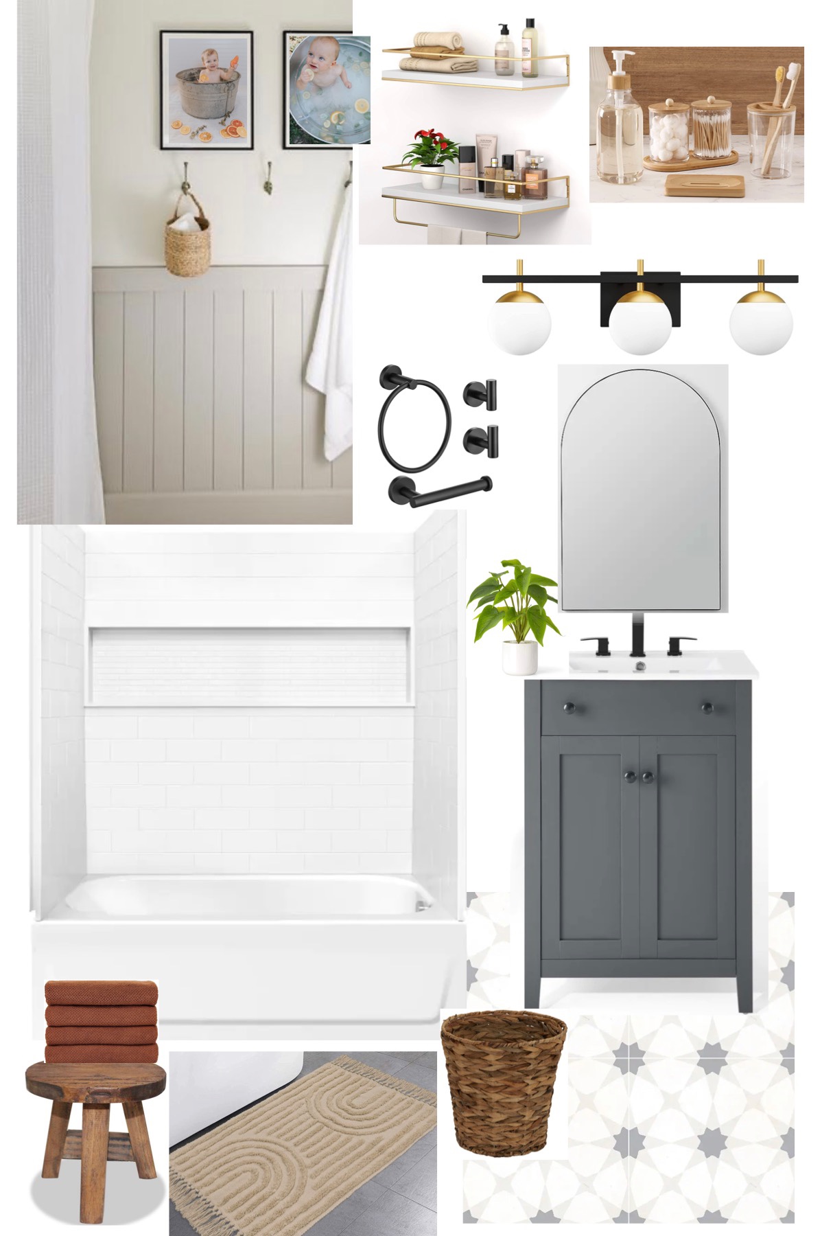
I started sourcing products long before we actually began renovating. Bathrooms are expensive and we tried to buy things a little bit at a time by shopping the sales and finding deals on Facebook marketplace.
We replaced the toilet pretty early on because we needed to anyway. I found the vanity on Facebook for $150, WITH the marble top and faucet, which saved us a ton of money!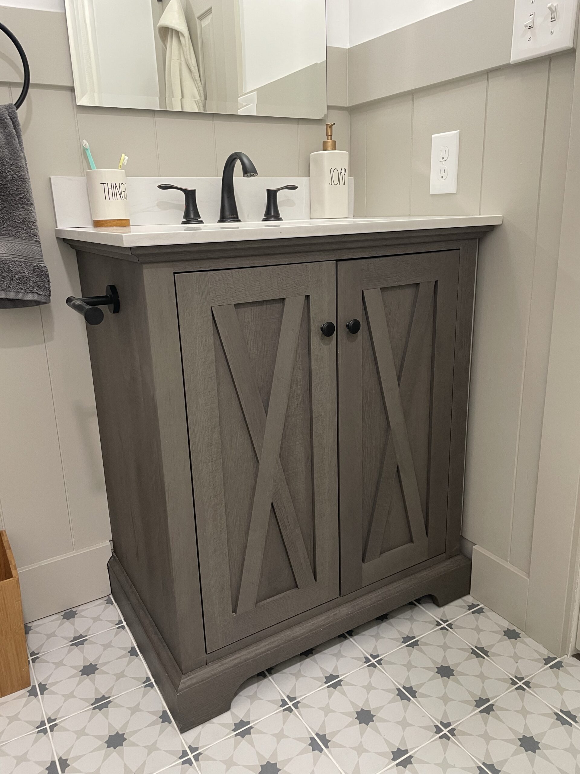
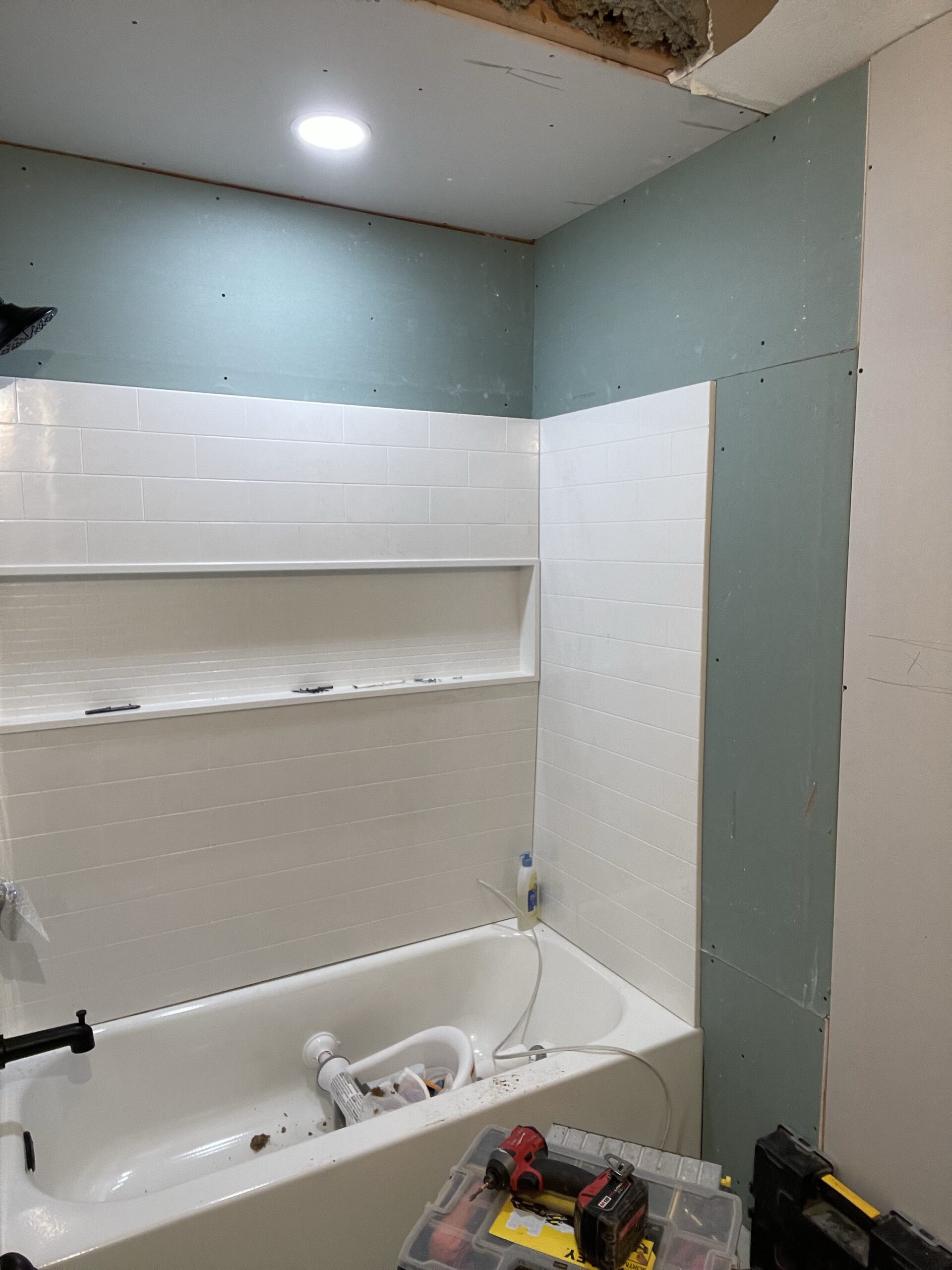
The bathtub and surround was the most expensive part, but still a time/money-saver compared to tiling! For a kid’s bathroom, something practical and easy to clean is the best option in my opinion, and this tub surround with the niche shelf all the way across is so nice for storage. 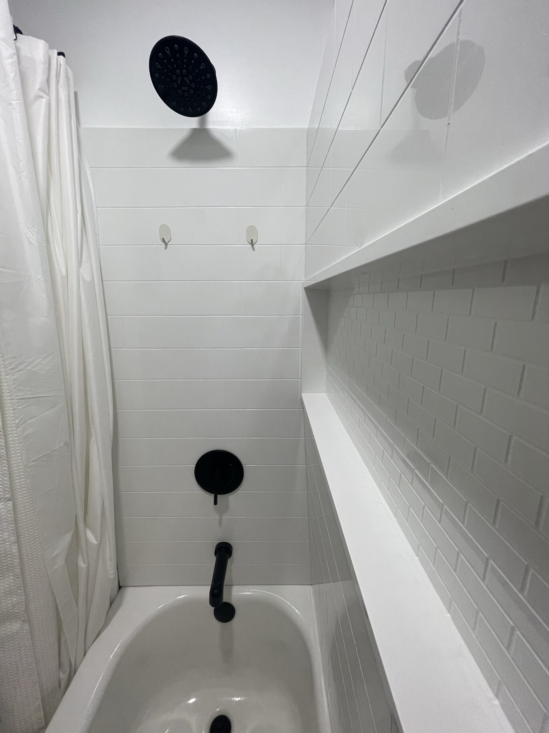 We found this at a local supply store for around $500 + $300 for the bathtub.
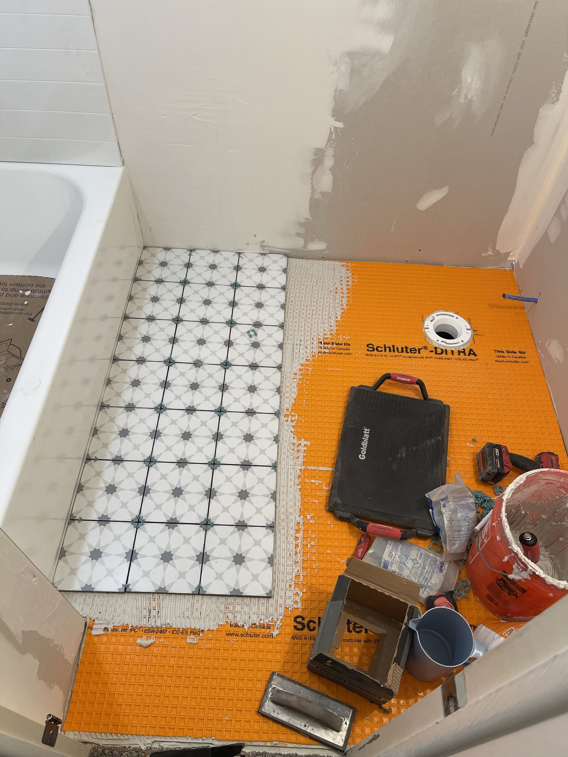
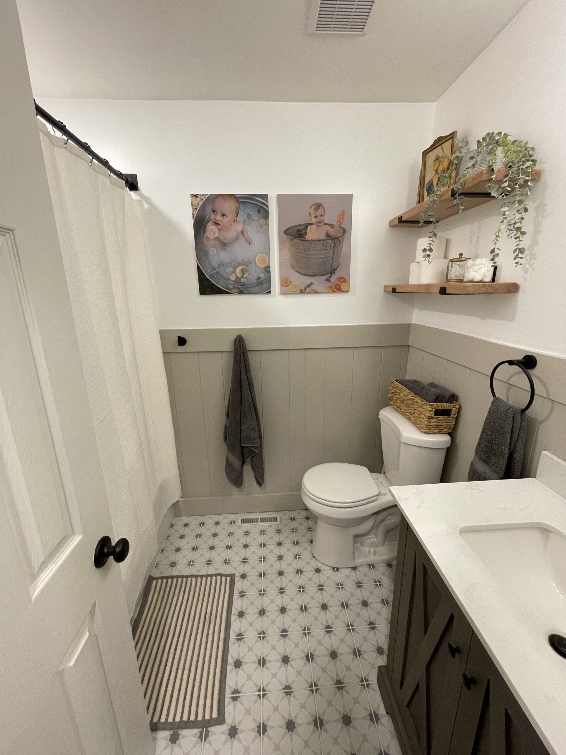
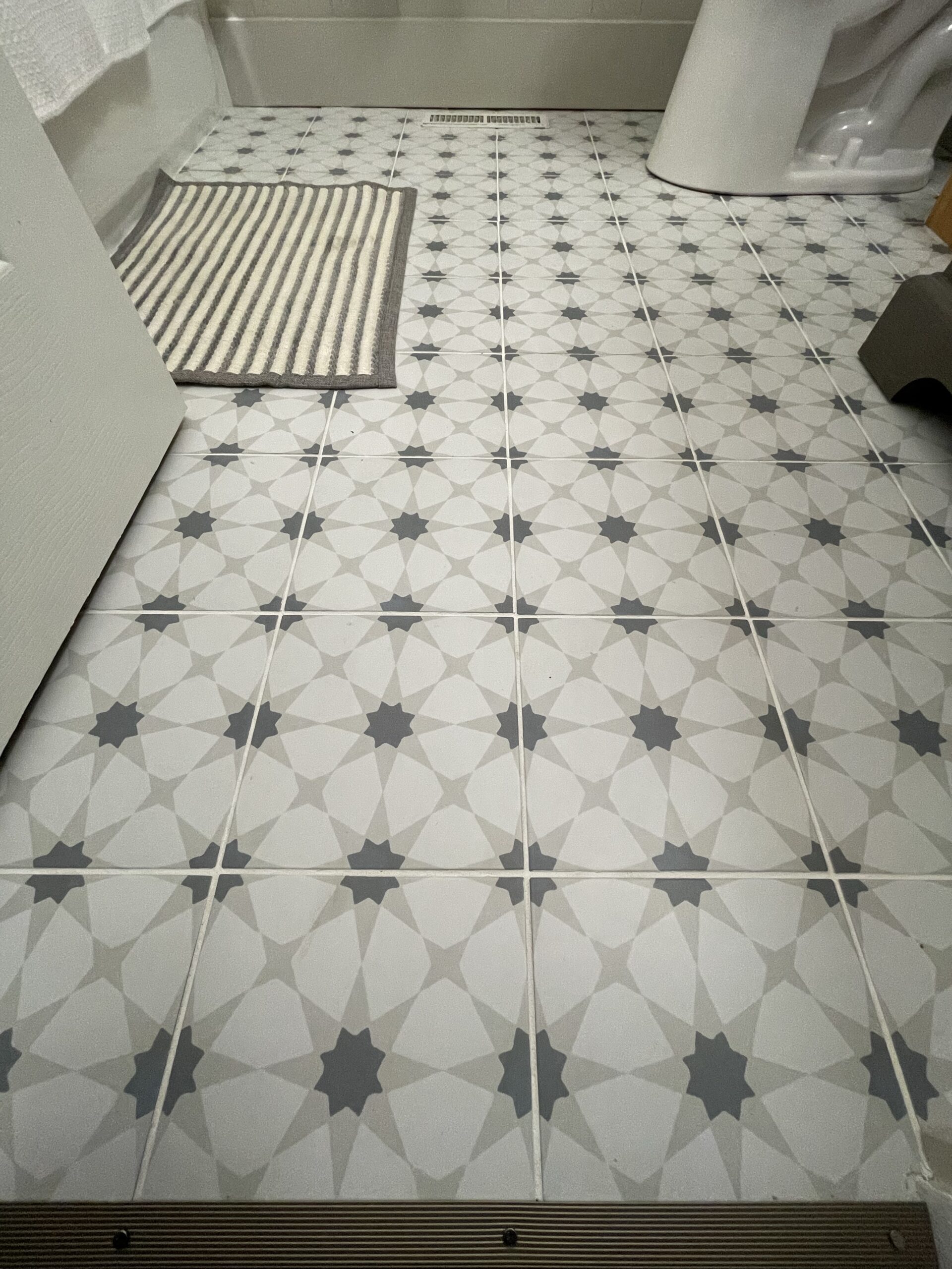
Since this is our kid’s bathroom, I wanted to do something fun for the floor. I looked at countless designs and I landed on these neutral geometric patterned tiles from Home Depot. 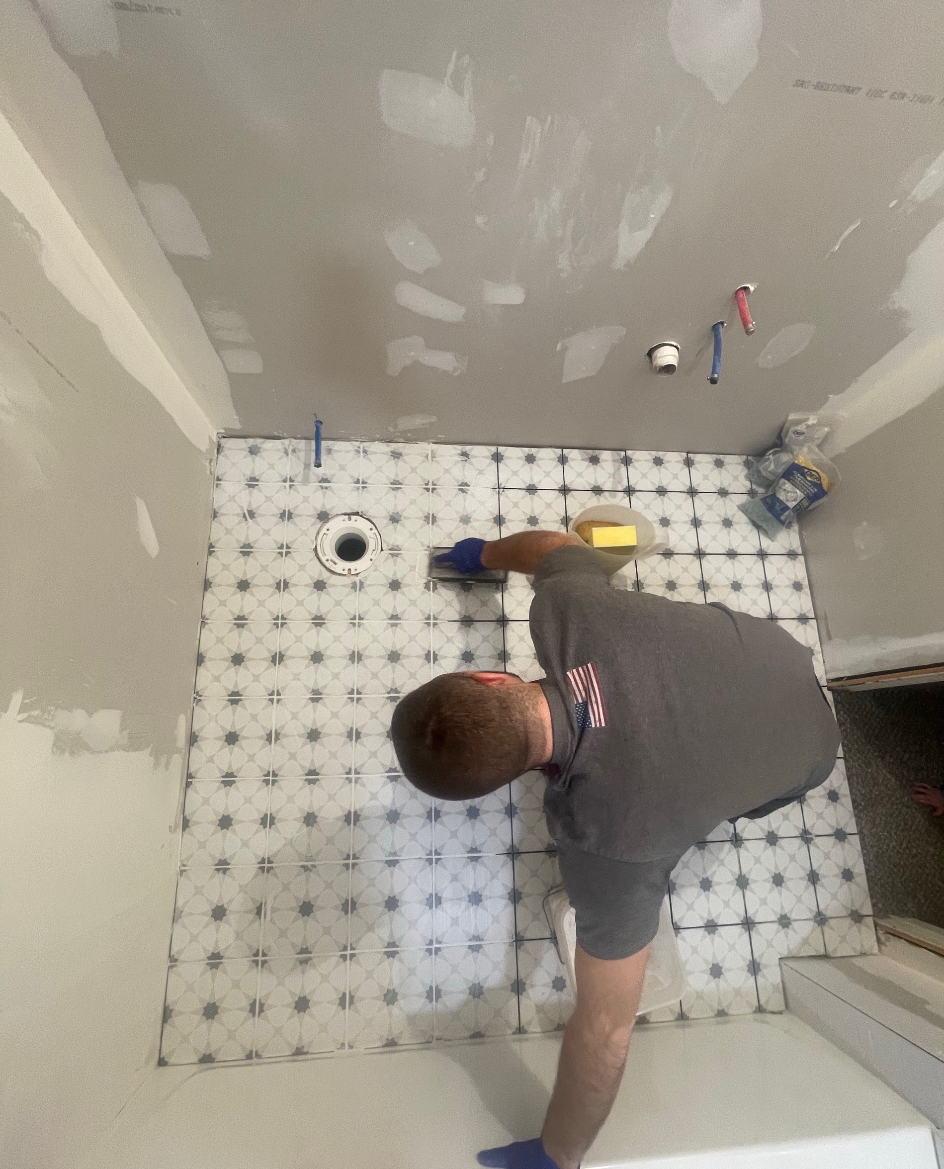 It was under $200 for all the tile, mortar, and grout. A really affordable upgrade from the brown vinyl that was there before!
WALL PANELING AND PAINT
The paneling on the walls really elevates the space as well. We tore out wood paneling in our basement and kept a few sheets to use in our laundry room. There happened to be just enough to go in this bathroom as well!
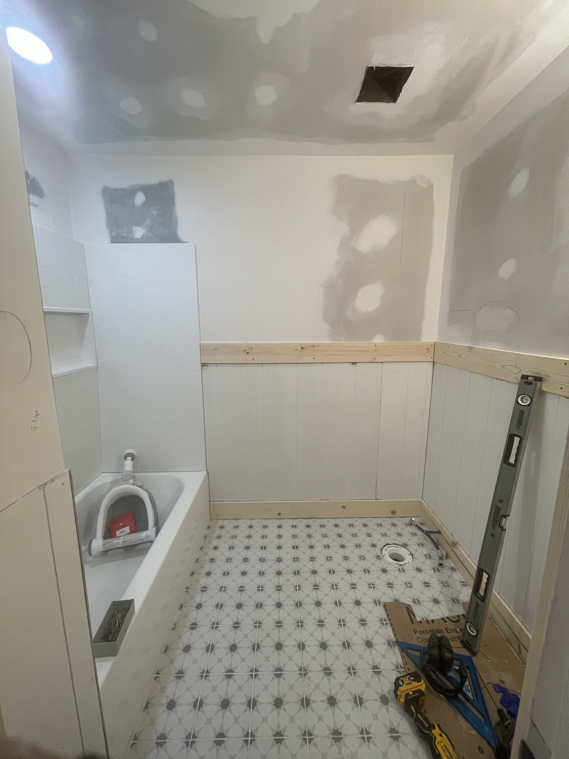
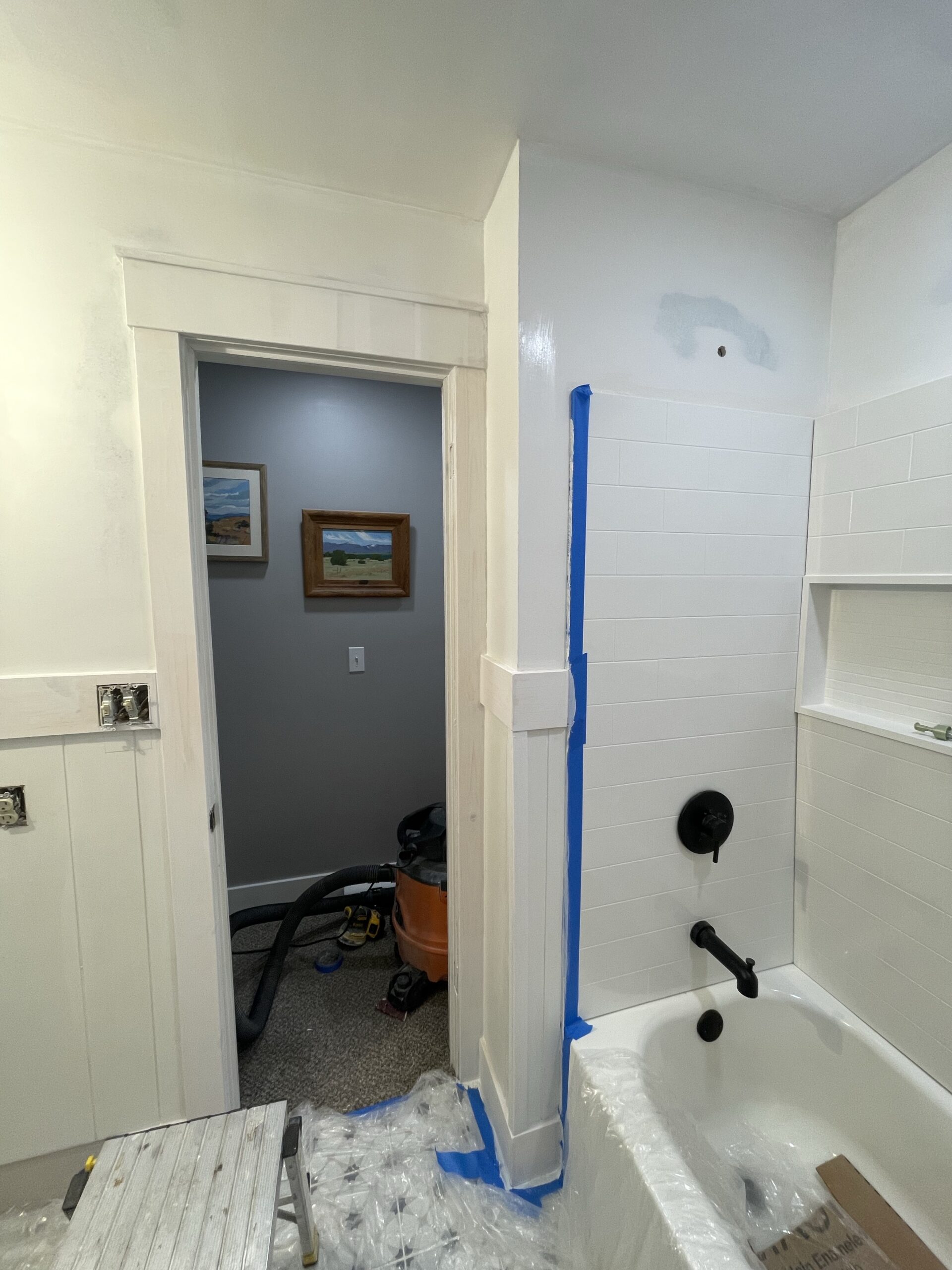
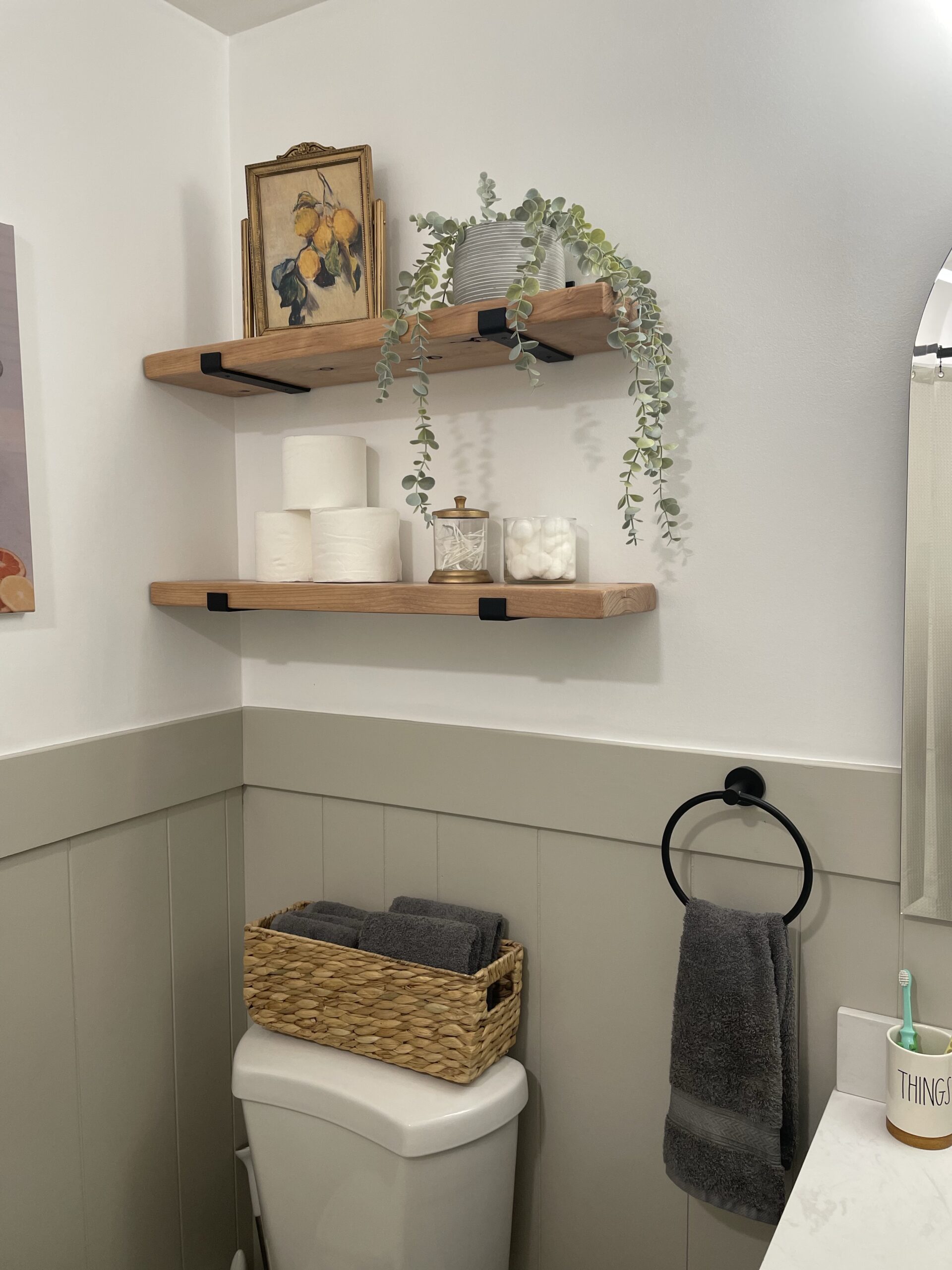
I really love being able to repurpose things from other projects that would normally be thrown away. The best part is that this upgrade only cost a can of paint!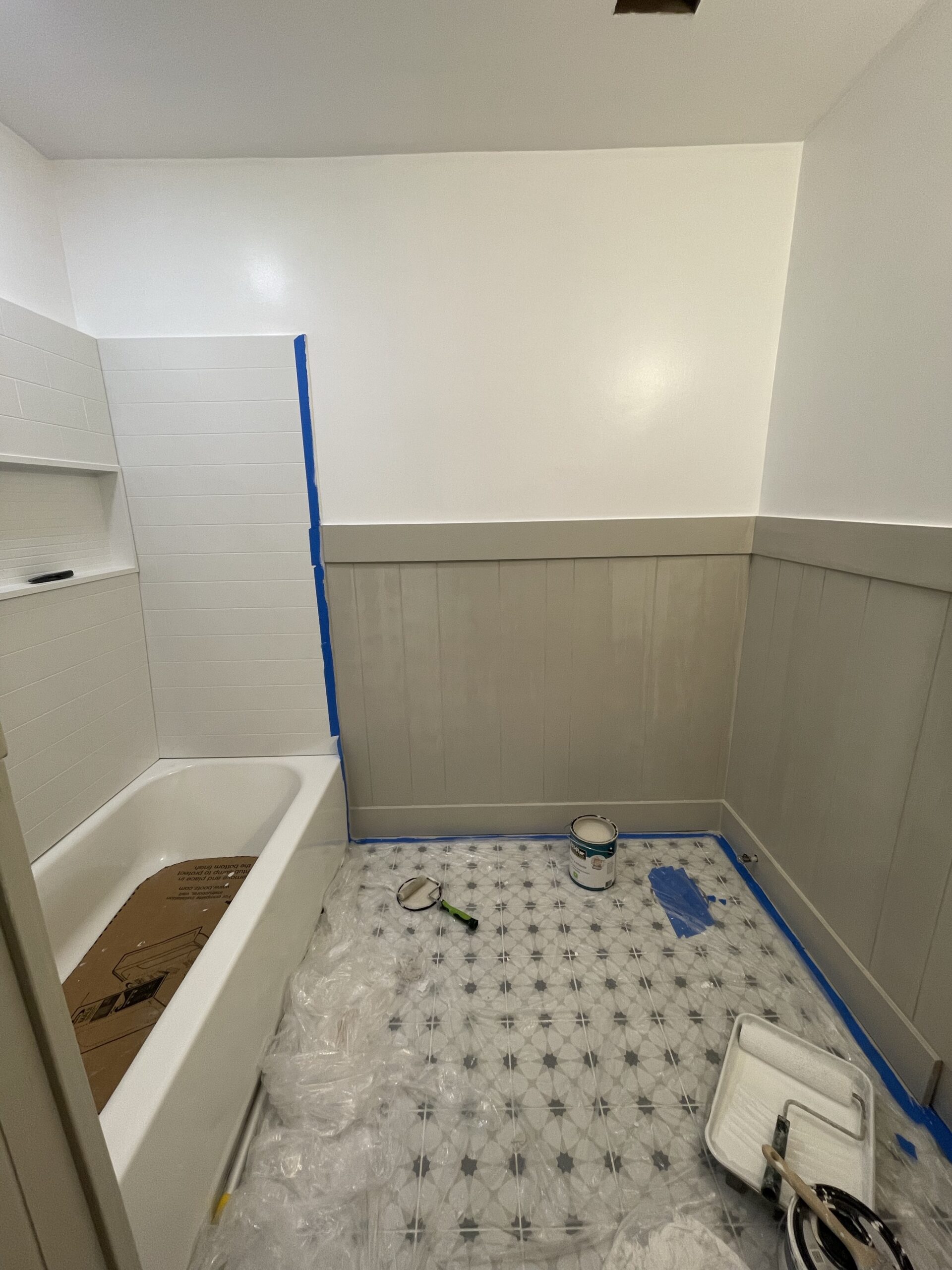
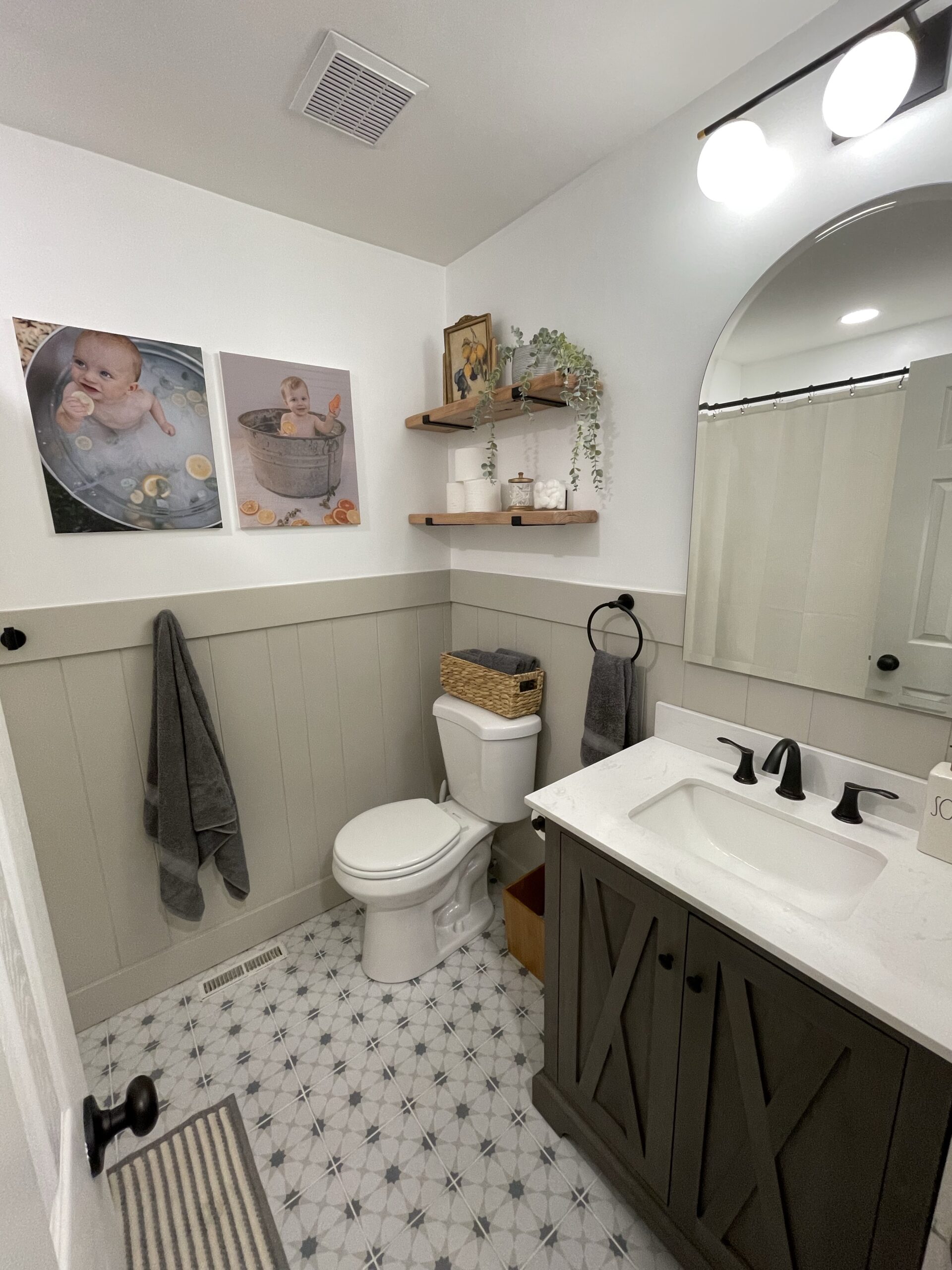
I chose the paint colors to match the tile. The tile has a dark gray color that ties in with the vanity, and the other color has a more beige-y undertone. That is what I wanted to use on the paneling. The color I picked is called “Vintage Taupe,” by Behr and it’s the perfect gray/beige in-between. The white is the same custom color we have on all of our trim/woodwork.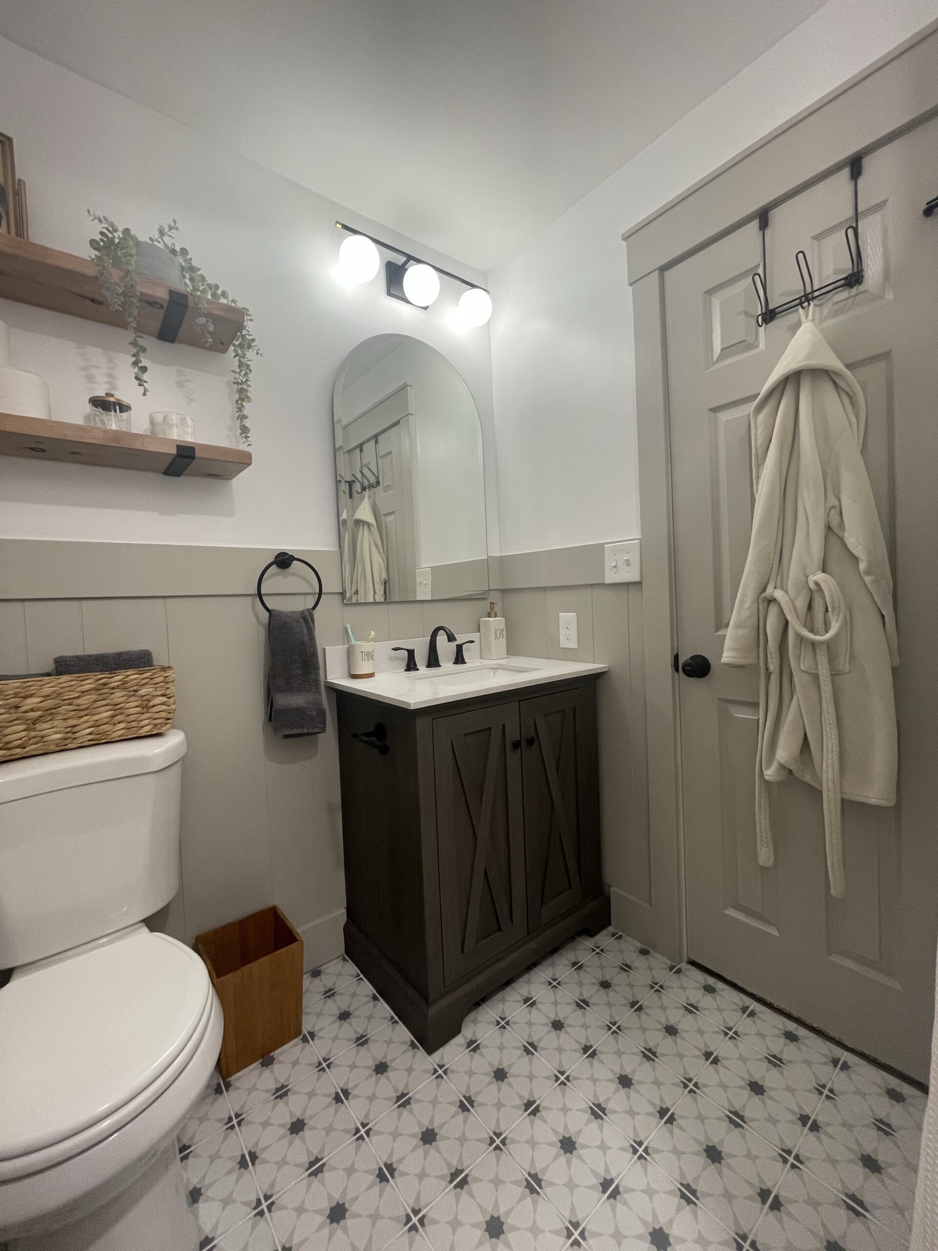
FINISHING TOUCHES
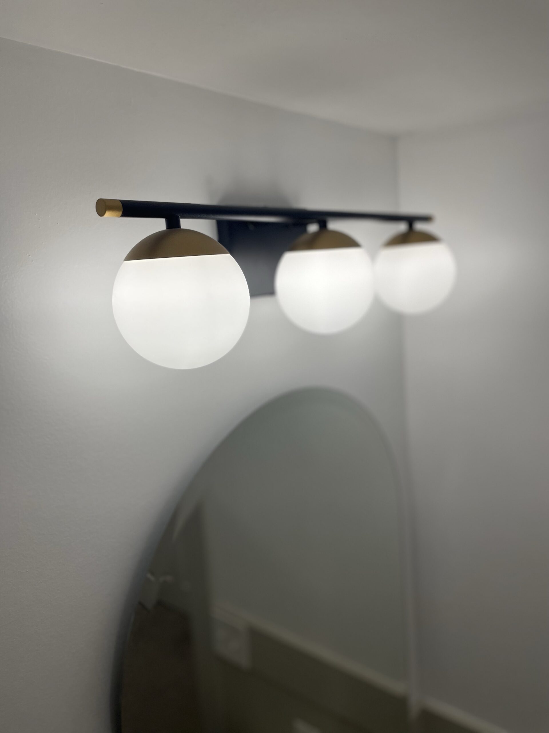
The mirror, believe it or not, was already in this bathroom! I was never a huge fan of it before, but seeing it in such a fresh clean space made me fall in love with it. The light fixture, hooks, and towel ring are all from Amazon, and I love the sleek modern look of them!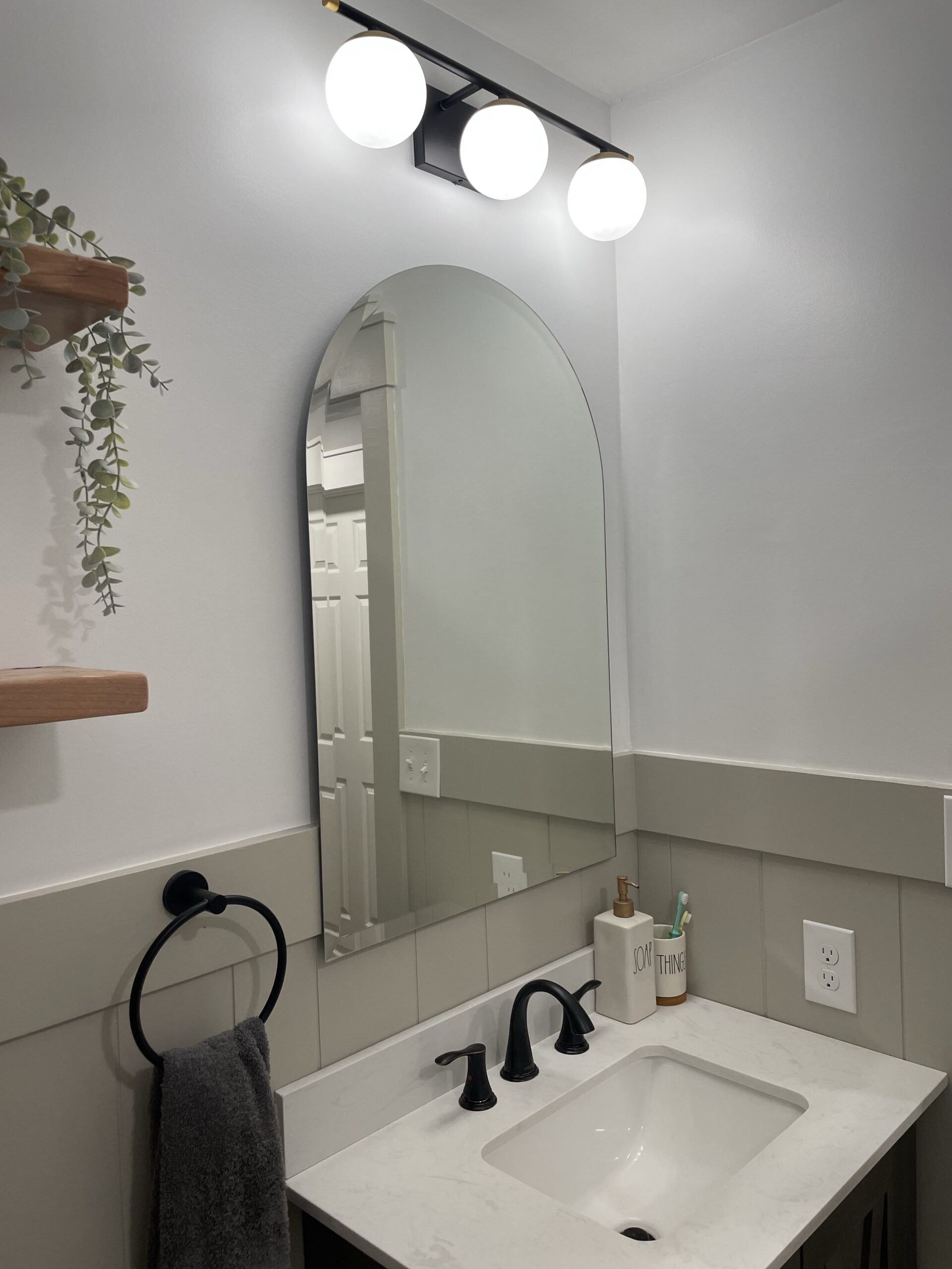
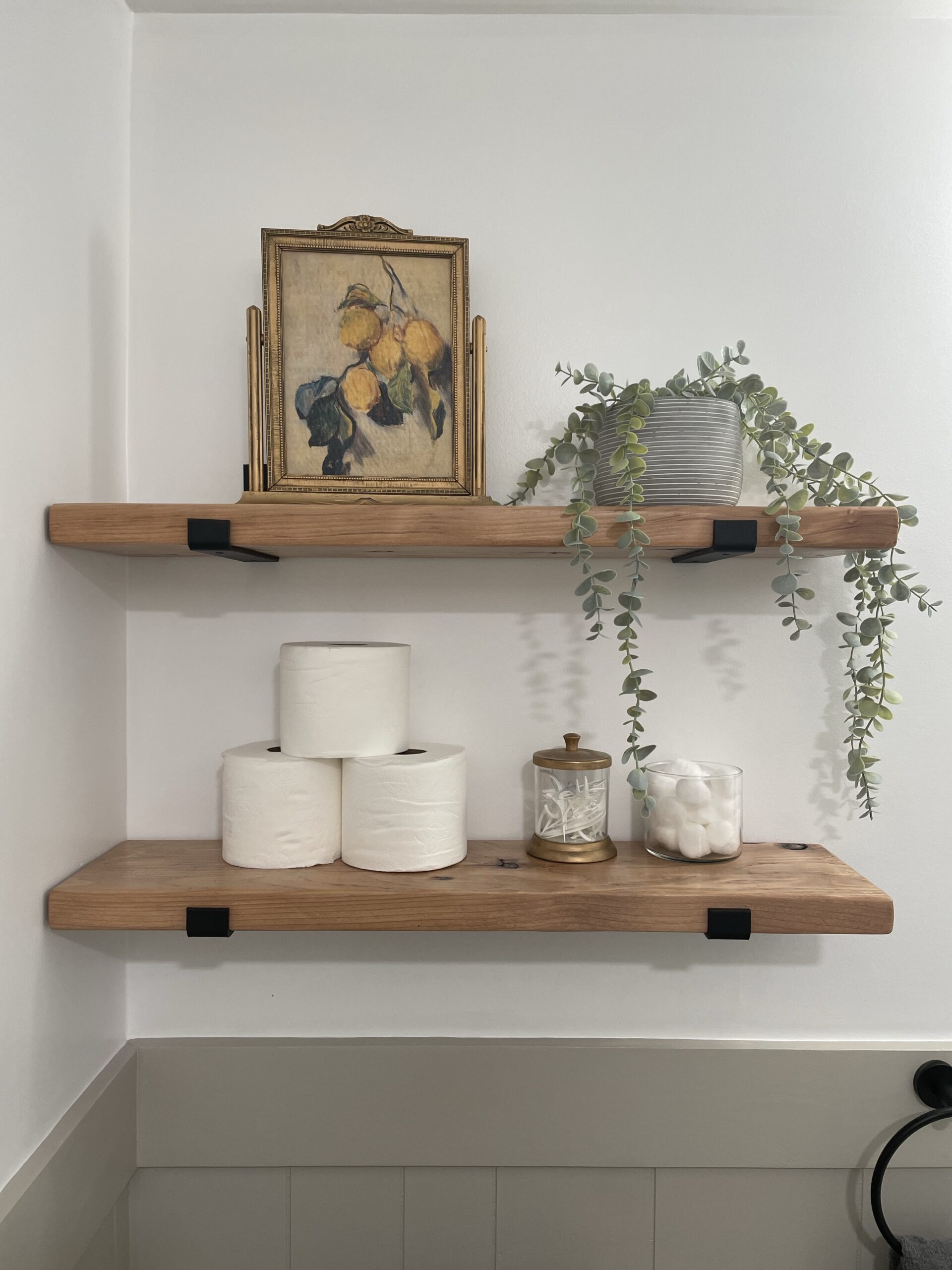
Since we lost the linen cabinet, we needed extra storage. We found some modern shelf brackets on Amazon, and stained 2×8 pine boards to bring some warmth into the space. I love the beautiful accent color of these shelves, and they are really functional storage!
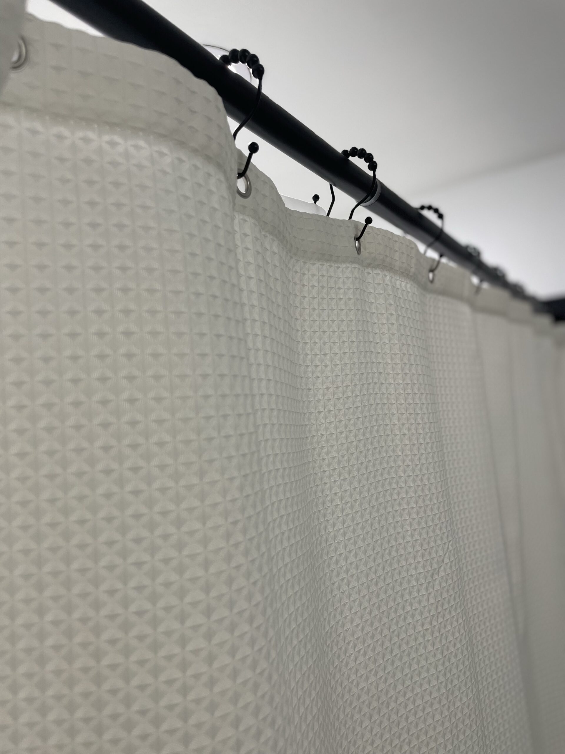
We’ve needed to upgrade our towels and shower curtain for a long time… but I’ve been holding off until this project was done! I feel like I’m using a luxury hotel bathroom now compared to what it was. Everything, again, is from Amazon lol.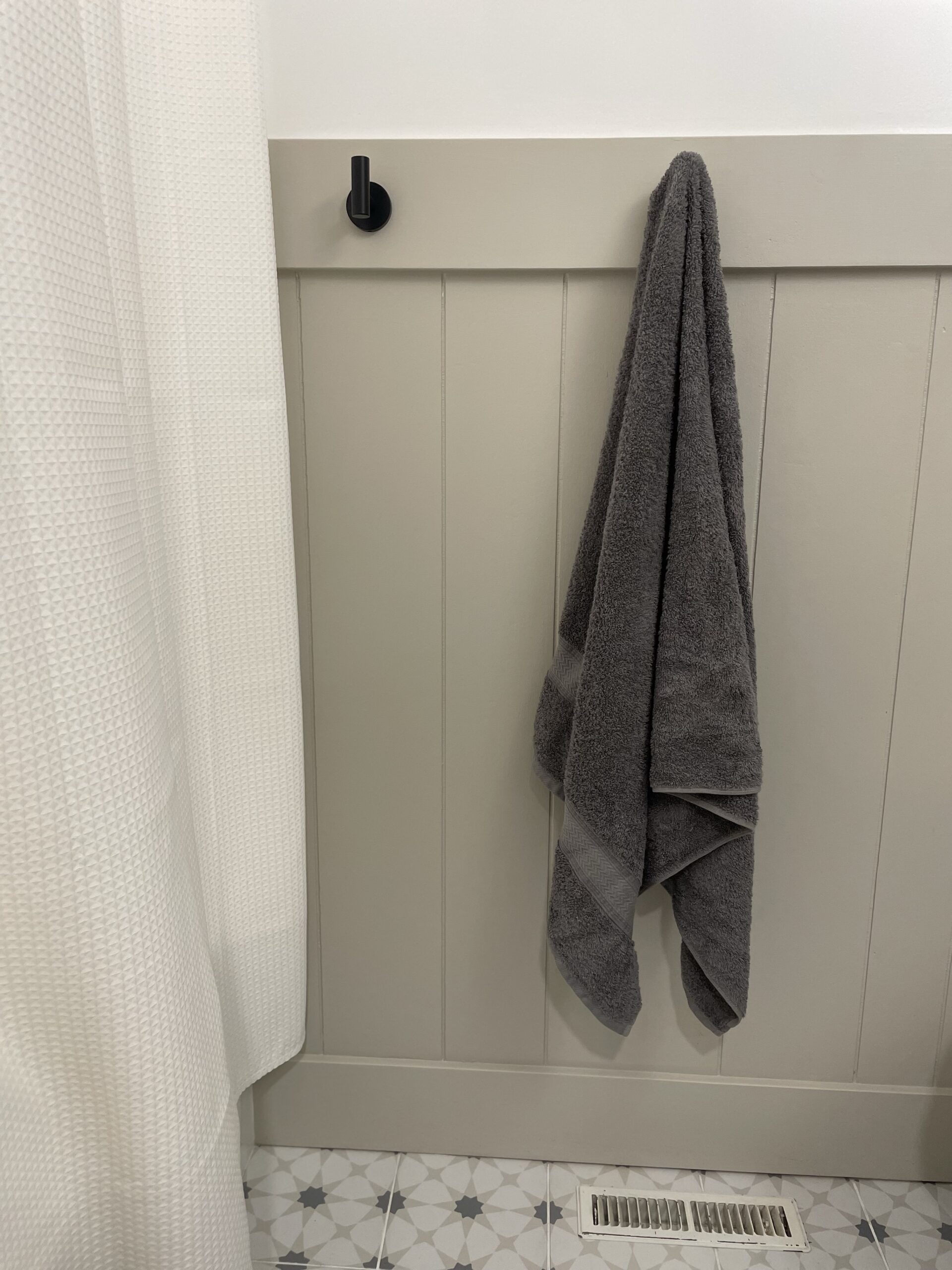
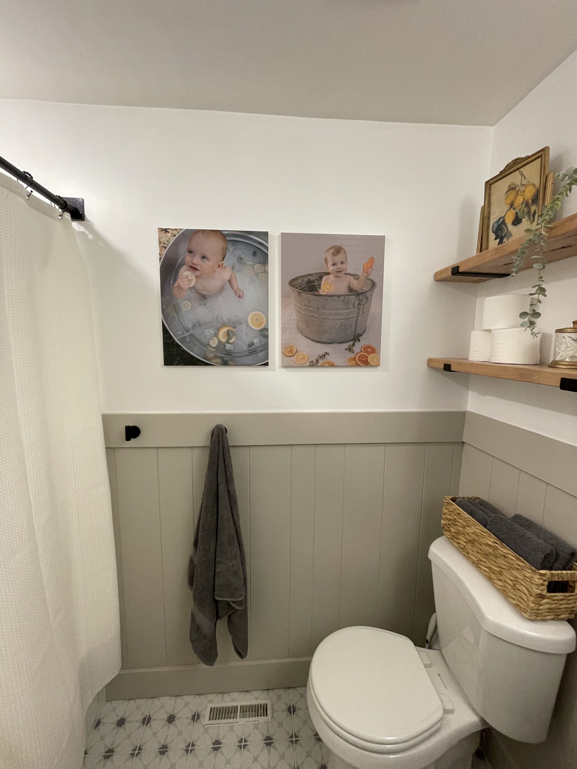
I love this lemon branch print I found on Etsy! I printed it myself and mod-podged over the top to make it look like an oil painting instead of a print. I put it in an antique frame that I picked up on marketplace. Total cost: $5!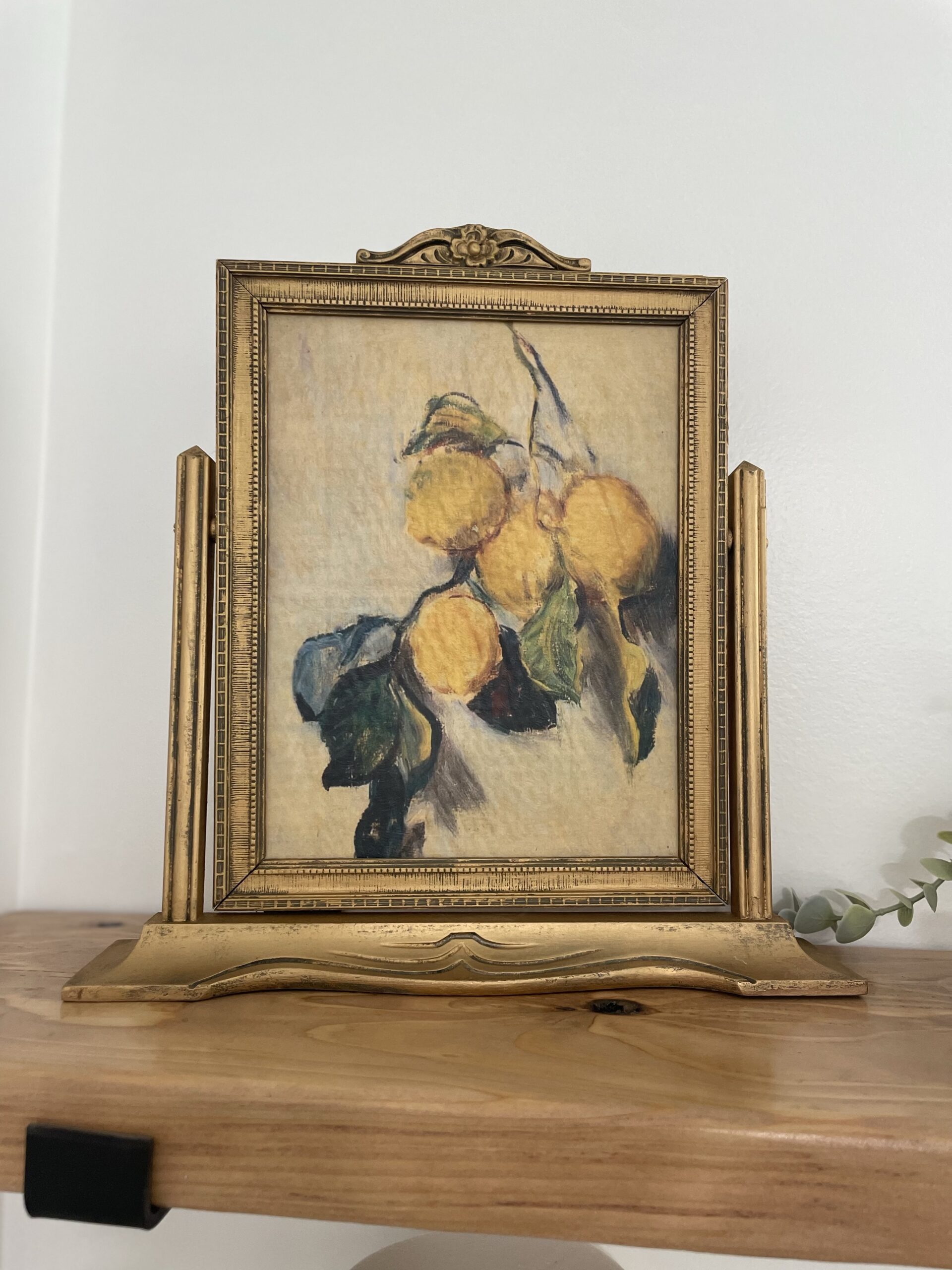 Of course, those little milk bath babies are my personal favorite! Both of our boys at 9 months.
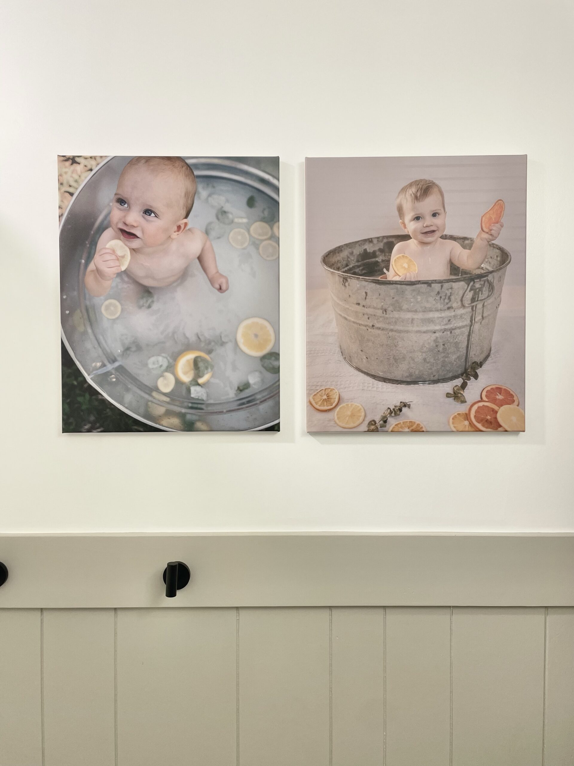
*Funny story: We always planned on doing this project, but what actually sparked us starting on it now was when I ordered these canvases and hung them up. I told Logan I was officially tired of the brown walls and I was going to paint them in the meantime until we can fully renovate. Then he started saying “well, it wouldn’t be that hard to replace the light fixture too… and the drywall needs repaired… we could go ahead and take out the linen cabinet and probably the bulkhead…” He had the linen cabinet torn out by that evening and a week later we were deep in the middle of the full remodel lol. All I’m saying is why didn’t I hang pictures up way sooner!? HA! But really I’m so grateful to have a hubby who has tools and knows how to do this stuff.
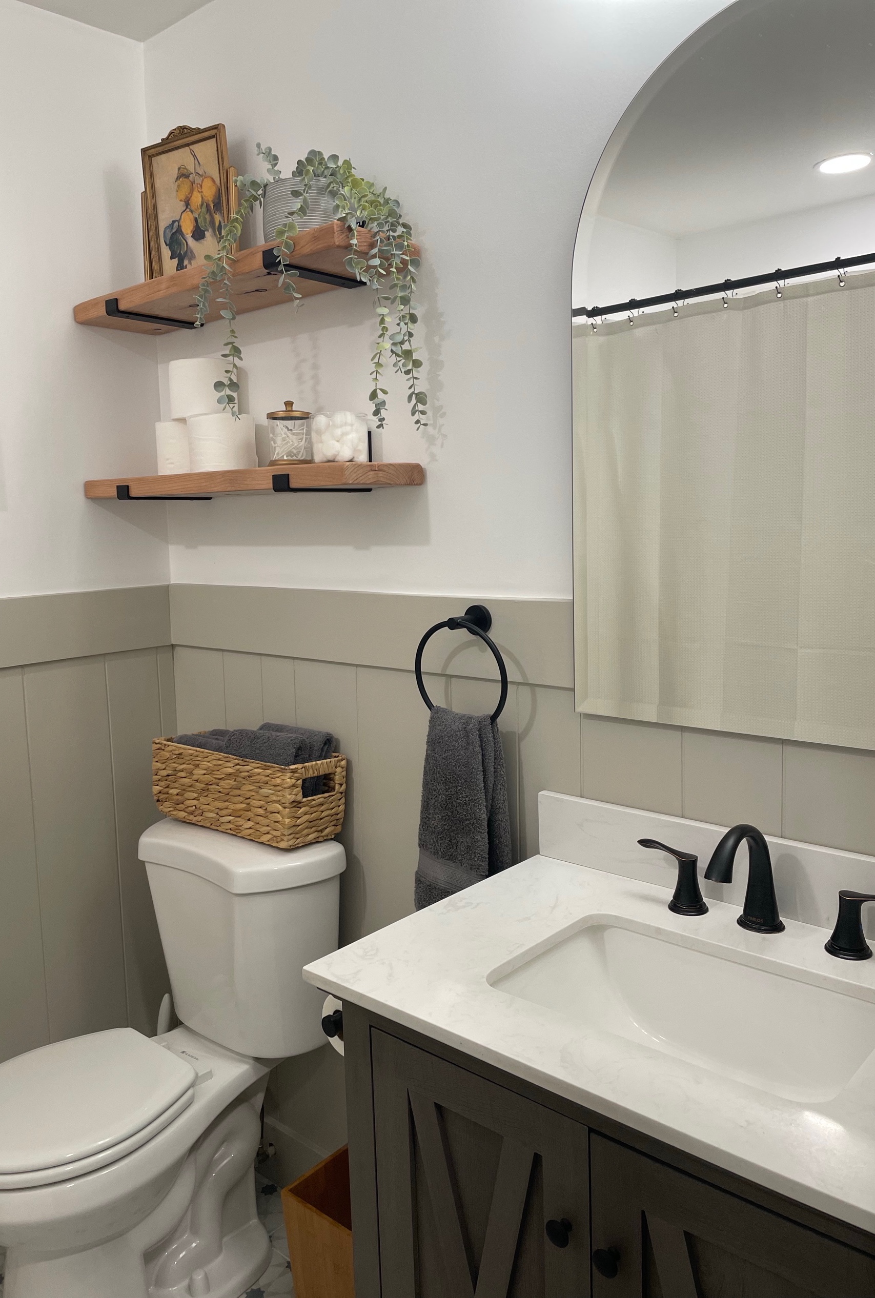
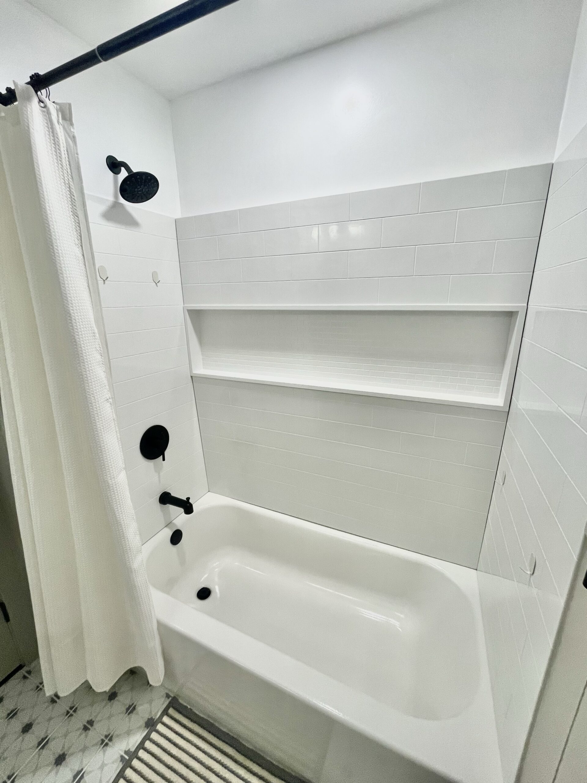
This is currently the only functioning bathroom on the main level. With four people using it on a daily basis, it does not look this clean and beautiful all the time! Most of the time it looks something like this…
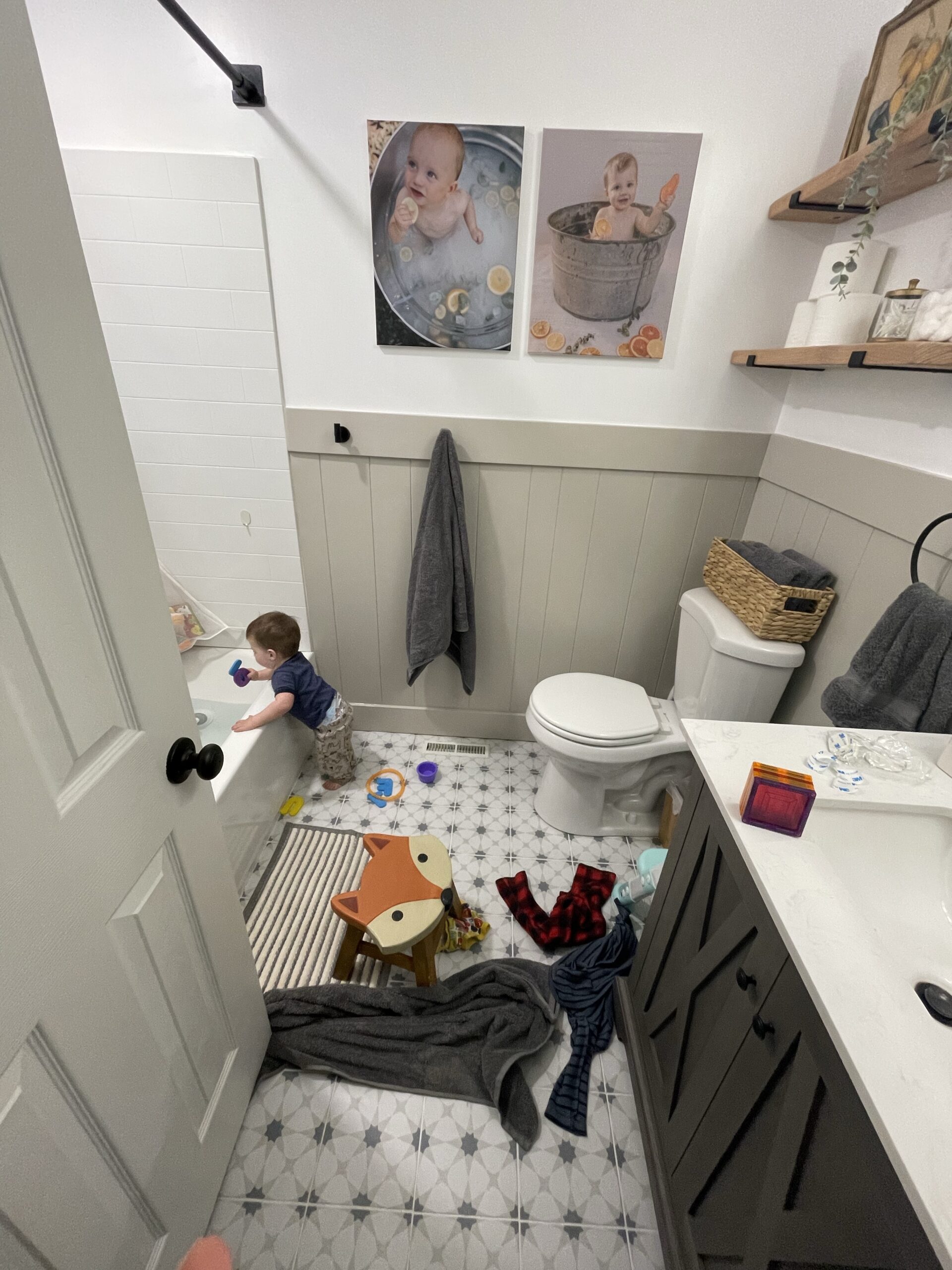
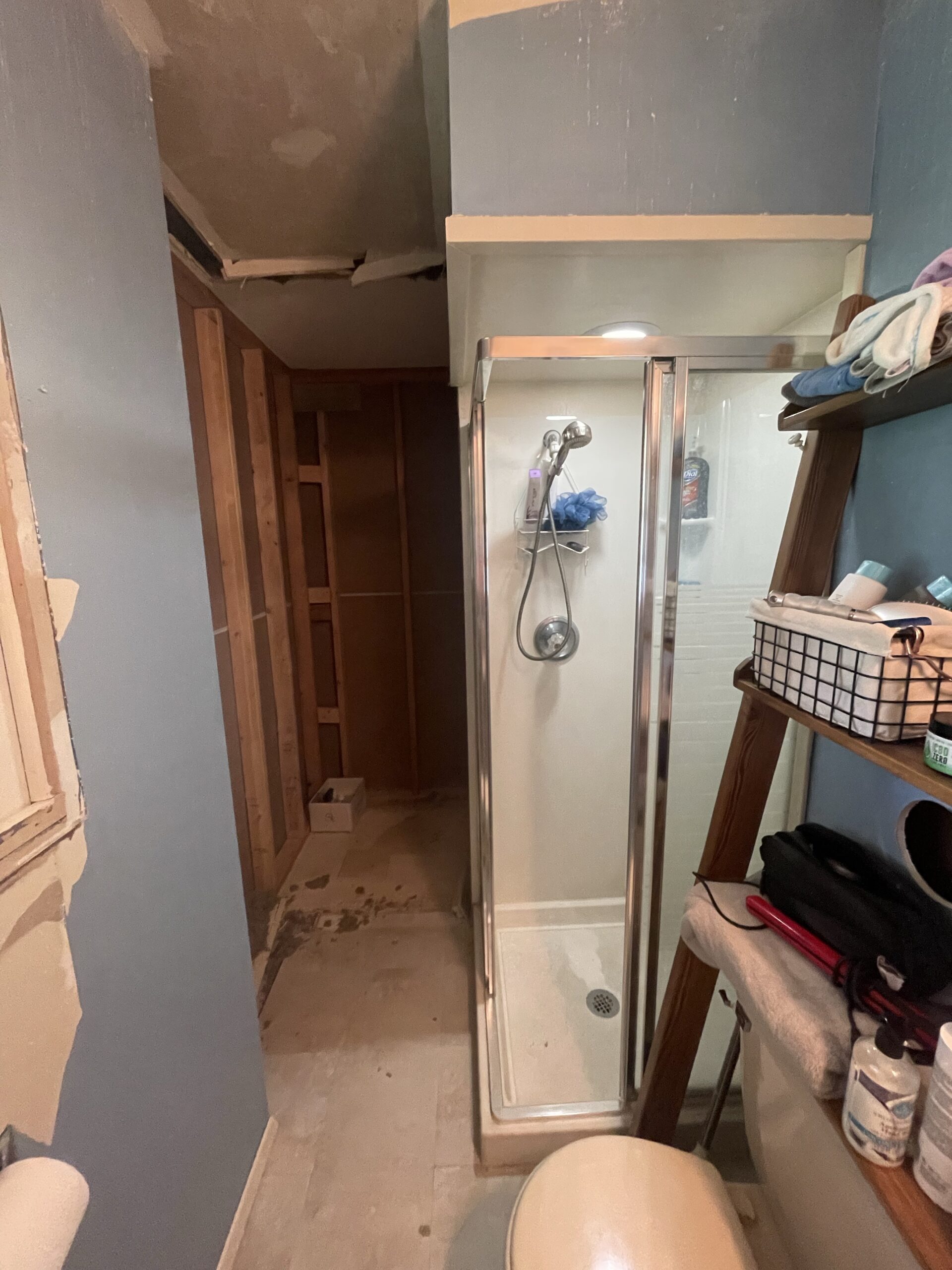
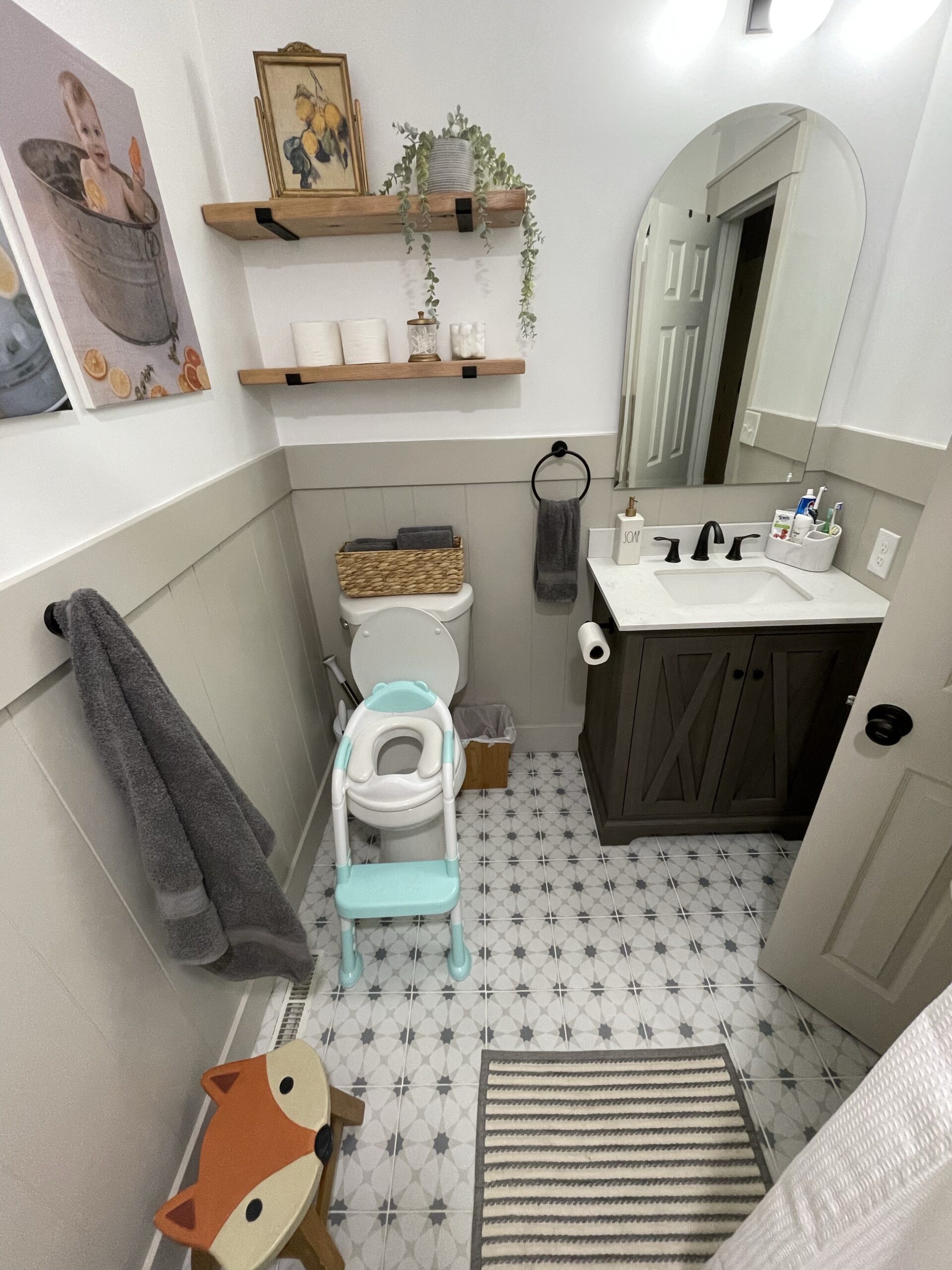 But I will take this over what it was any day! And it sure beats the state that our master bathroom is in currently… there’s a toilet, no sink, and a janky 2’x2′ shower thing that I’m scared to use lol.
FINAL PHASE
The last phase of this remodel is tearing out the (old) temporary wall in the master bathroom and completely gutting the rest of it. The space for the large shower is already there, and we’ll be adding a double vanity and some kind of linen cabinet/storage. 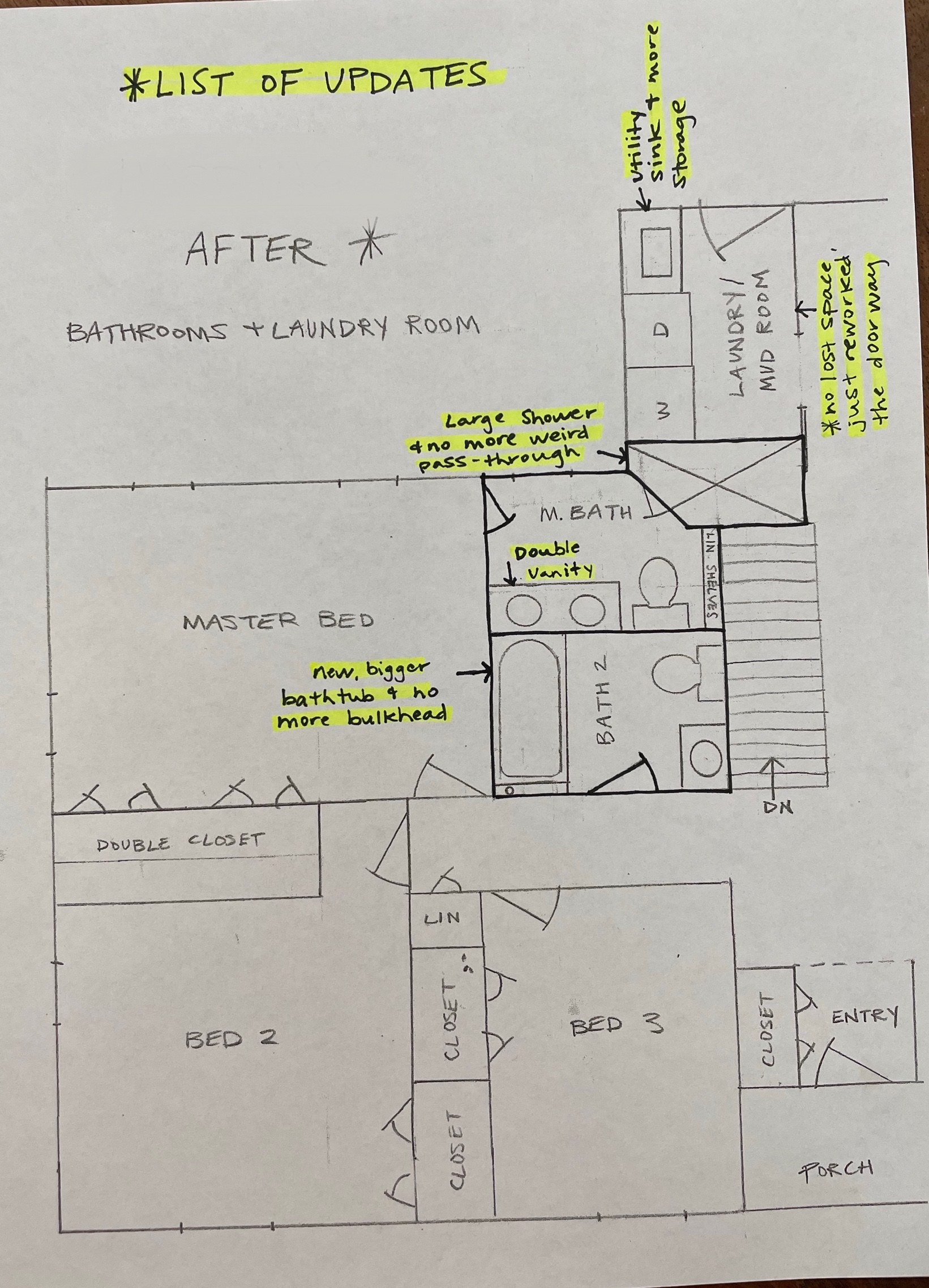
We haven’t decided exactly when we can start on it, but probably towards the end of this year at the soonest. We have some other projects and also some travel plans this summer. But I have so many ideas for it, and I’m so excited to share those!
For now, we’ll be enjoying our newly refinished bathroom! Once again, thanks so much for reading and sticking with my inconsistent posts lol… God bless!

XOXO
ASHLEY DIANN
